A paraphrased transcript of my talk at SMX Munich 2013
Let’s start with a little game. In iOS, there’s an ad tracking feature that allows advertisers to identify you (albeit anonymously). It’s turned on by default. Let’s see if we can work out how to turn it off together. Go into your settings and scroll down.
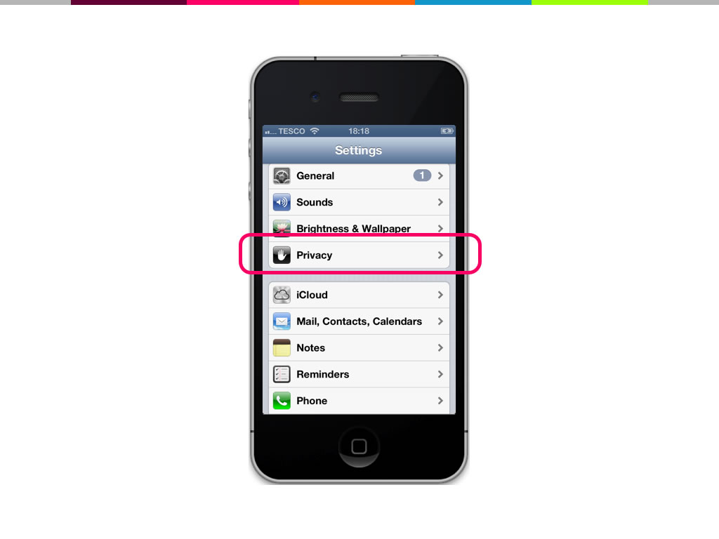
There we go! Ad tracking must be in “Privacy”, right?
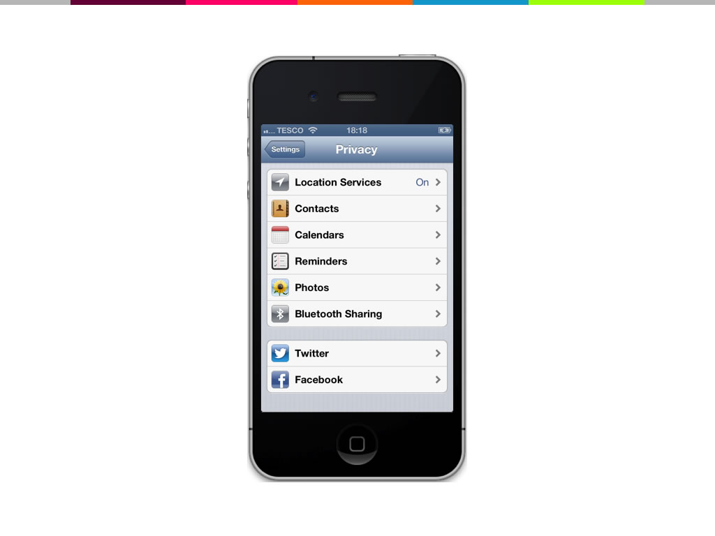
Oh. That’s strange, ad tracking isn’t in the privacy menu – so let’s keep looking. Let’s go back to the main settings page and go into “General”.
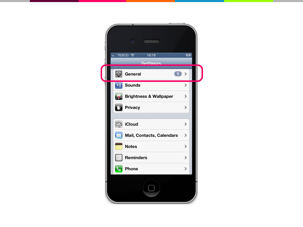
“General” is a crappy name for a menu item. It’s basically a bucket of miscellaneous stuff that they didn’t know what to do with. If we tap it, this is what we see:
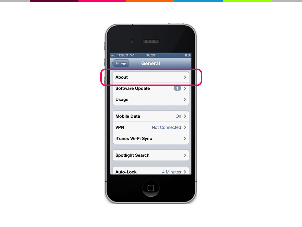
The first item inside “General” is labelled “About”. Do you think Ad Tracking is in there? It’s a bit of a long shot, but let’s take a look:
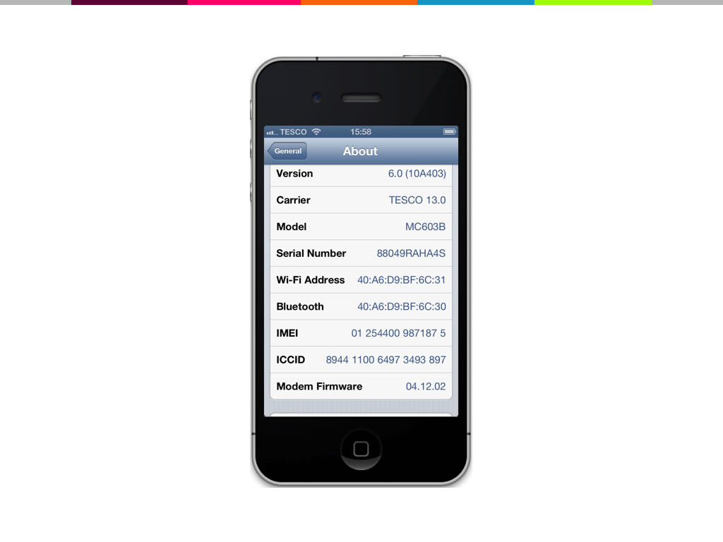
Yawn – nothing to see here! But wait, what’s this at the very bottom?
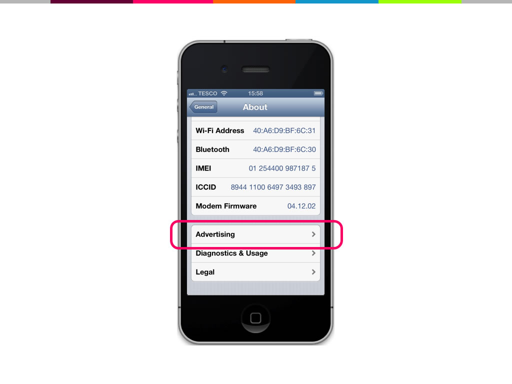
Advertising. Well I never – let’s tap it and see.
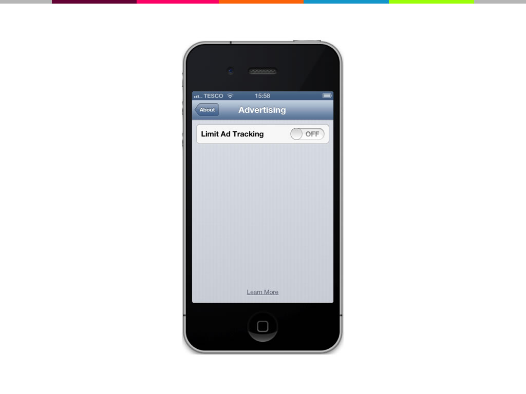
We’ve found it! Even better, it says “Limit ad tracking off”. So ad tracking is off already. I’m not being tracked, thank goodness.
But wait a minute. It doesn’t say “Ad tracking – off” it says “Limit ad tracking – off”. So it’s a double negative. It’s not being limited, so when this switch is off, ad tracking is actually on.
Off means on! This is actually a great example of what I define as a Dark Pattern. It’s a user interface that uses manipulative techniques to get users to do things they would not otherwise have done.
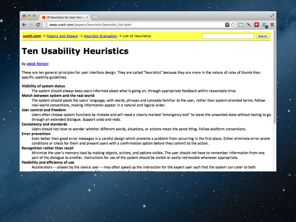
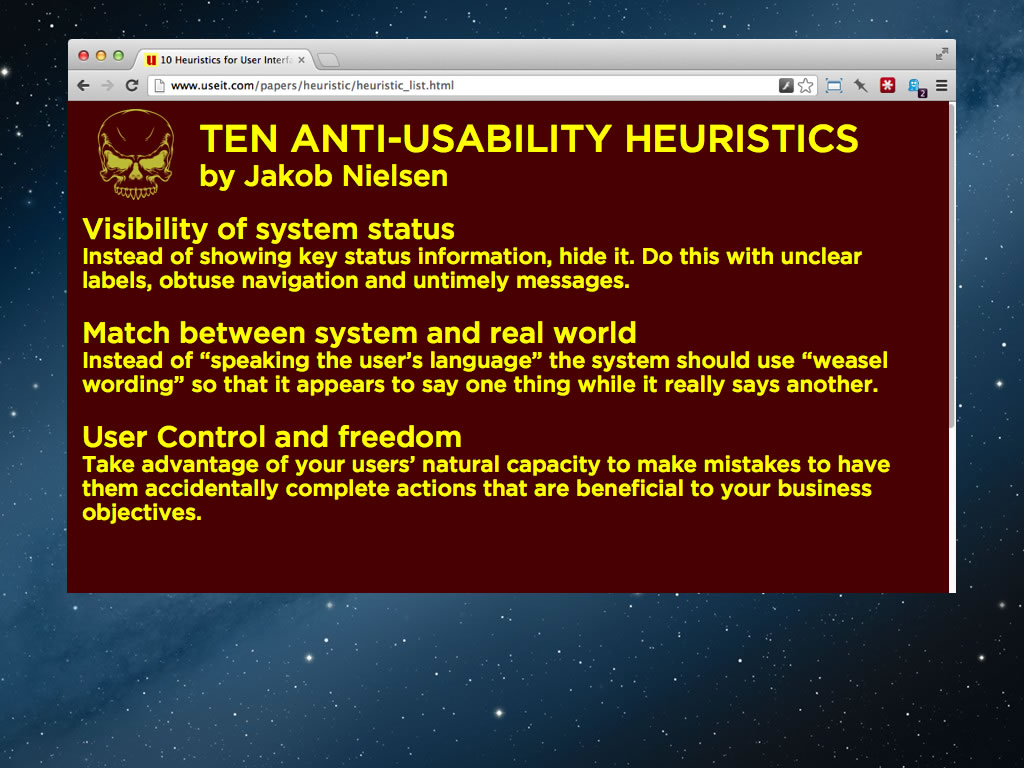
The thing about Dark Patterns is that you design them from the exact-same rulebooks that we use to enhance usability. Here’s Nielsen’s ten heuristics, probably one of the most well known set of usability guidelines, created back in the early 1990s.
And here they are inverted!
We can take those three and they pretty much spell out the strategy that Apple used in the example we’ve just seen. One of the things that interests me is the question of why organisations do this sort of thing. I think there are a number of reasons, but the main one is the way targets are set and followed.
To explore this, I’d like you to join me in a little thought experiment. Imagine you’re operations director for an NHS hospital in the UK. Imagine you’ve got three kids and a big mortgage. This job is everything to you. So how would you react when your boss says to you that you have to cut wait times to under 5 minutes per patient or you’re fired. Just think about this for a moment. You’ve got no spare capital, no spare staff time, no way to stretch your resources. How can you possibly do this?

Image credit: Gary Rowlands
Well here’s a little idea. How about you create a job role for a nurse where their job is simply to say hello to new patients. Nothing more. That way the patients are seen to, that way the wait time problem is solved. You get to keep your job. Sounds devious – but this really happened throughout the NHS in the 90s.
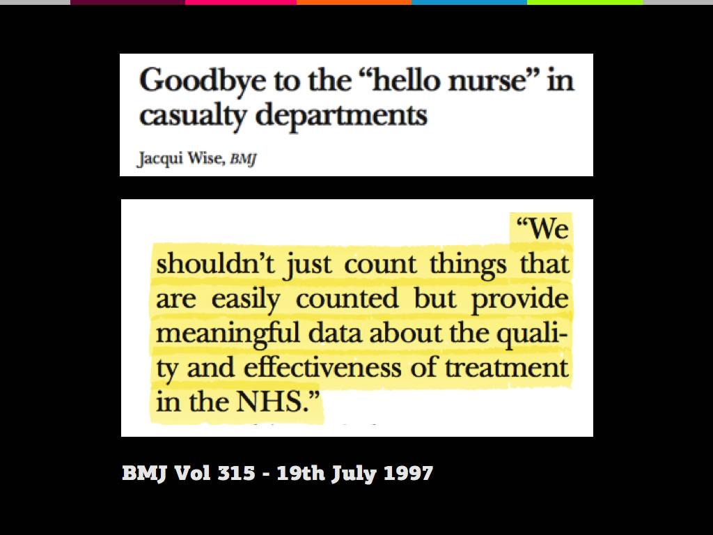
After about 5 years, the NHS realised what they’d done. An NHS spokesperson admitted in the British Medical Journal that: “We shouldn’t just count things that are easily counted – but provide meaningful data about the quality and effectiveness of treatment in the NHS.” So let’s just summarise:
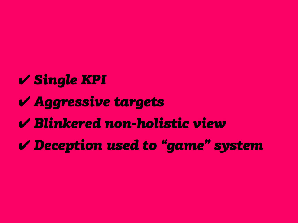
They hit their targets – they did their jobs – and it looked good on paper; but in reality they created a cheaper, nastier experience. In other words, they created a Dark Pattern – just like Apple’s ad tracking UI.
To put it another way, Dark Patterns are often conversion rate optimisation projects that have gone wrong because of an unhealthy working environment. Back in 2010 I became pretty obsessed with black hat UIs so I created this term – Dark Patterns – as a sort of awareness drive – and it worked. I created darkpatterns.org for the community to name and shame the worst offenders. It gets featured in the press every few months, and this creates pressure on the offenders. A few of them have actually been embarrassed into changing their UIs for the better, which is nice.
Now what I could do for the rest of the talk is just walk you through each of the examples on the site. But there’s not much point as you can just go read that on your own time. So instead I’m going to show you some new examples that I’ve gathered together especially for this talk. Let’s start with marketing emails. I’ve chosen this example because I’m certain that most of us here have faced this exact challenge.
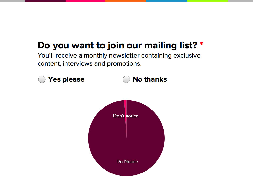
Imagine this is part of a website registration form. After the user has entered their email address and a password, we want them to join the mailing list – right?
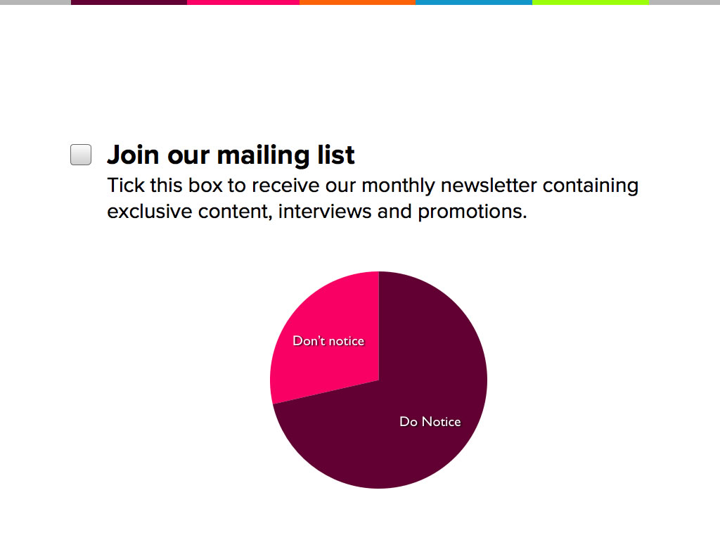
Well, this particular approach is fairly standard but isn’t hugely effective because users have to take an explicit action to opt in. Chances are they’ll be in a hurry and a proportion of users wont even notice this text – that’s the pink proportion on the left there.
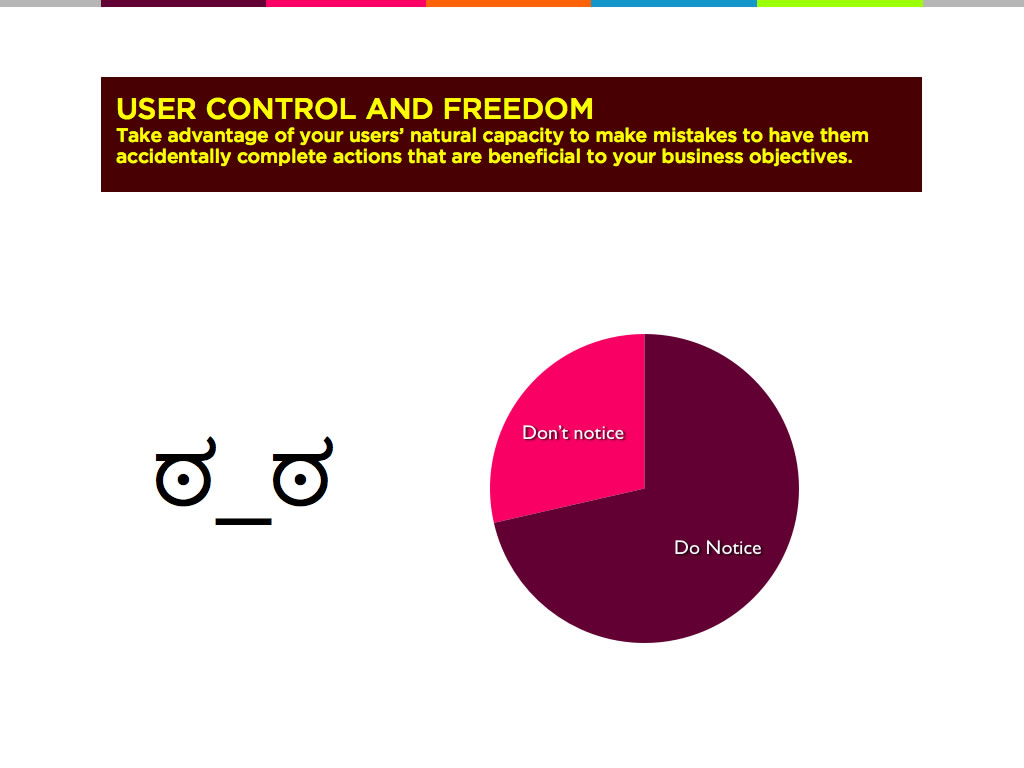
How about this? Mandatory yes / no radio buttons with neither option pre-selected.
This way you’re guaranteed that user will have to make a choice. Everyone has to notice! This seems pretty ethical, doesn’t it. But on the other hand. if we think back to our anti-usability principles, we can use the phenomenon of not noticing to our advantage! How about we design it so that when you don’t notice, you opt in by mistake.
On post-office.co.uk, they do just that. Here, a tick means no. It’s kind of clever because culturally, a tick is an affirmative action.
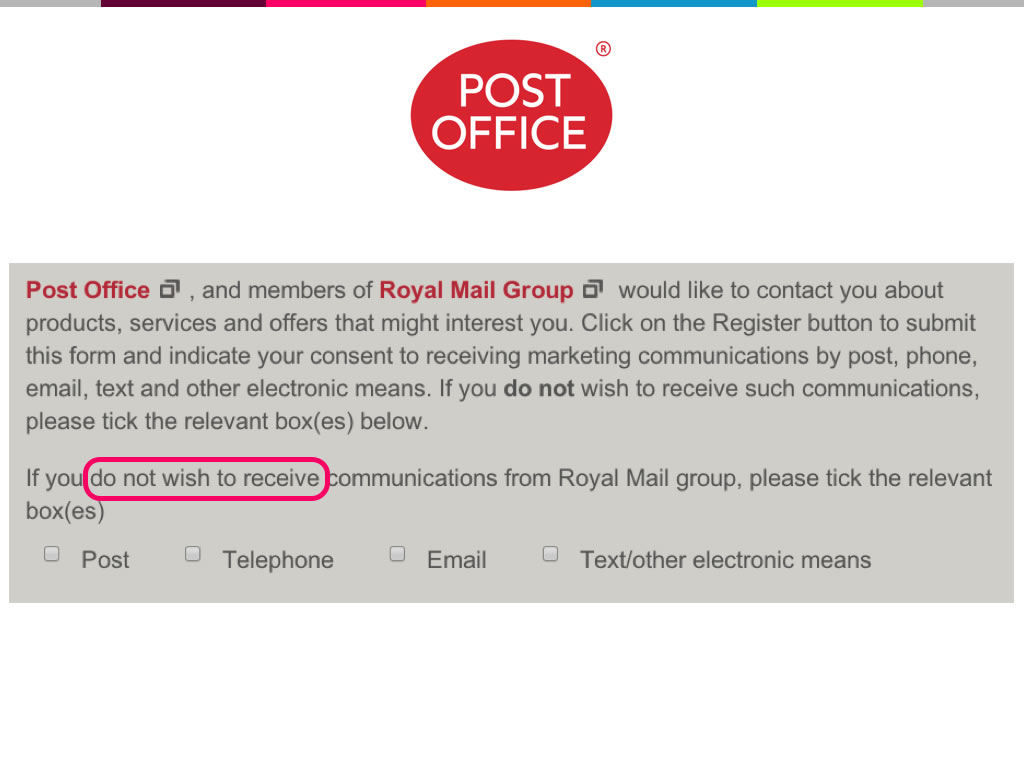
And they’ll definitely get opt ins from those people who don’t pause to read this stuff. On the one hand this works – they will boost the mailing list opt-in rate – but a certain number of people will realise that the website is pulling a trick and they will swear angrily under their breaths. It’s probably not going to make them drop out just yet, but it is going to tarnish the brand reputation, at least a little bit.
Royalmail.co.uk takes it a step further. Two rows of check boxes, the first is tick to opt out, the second is tick to opt in.
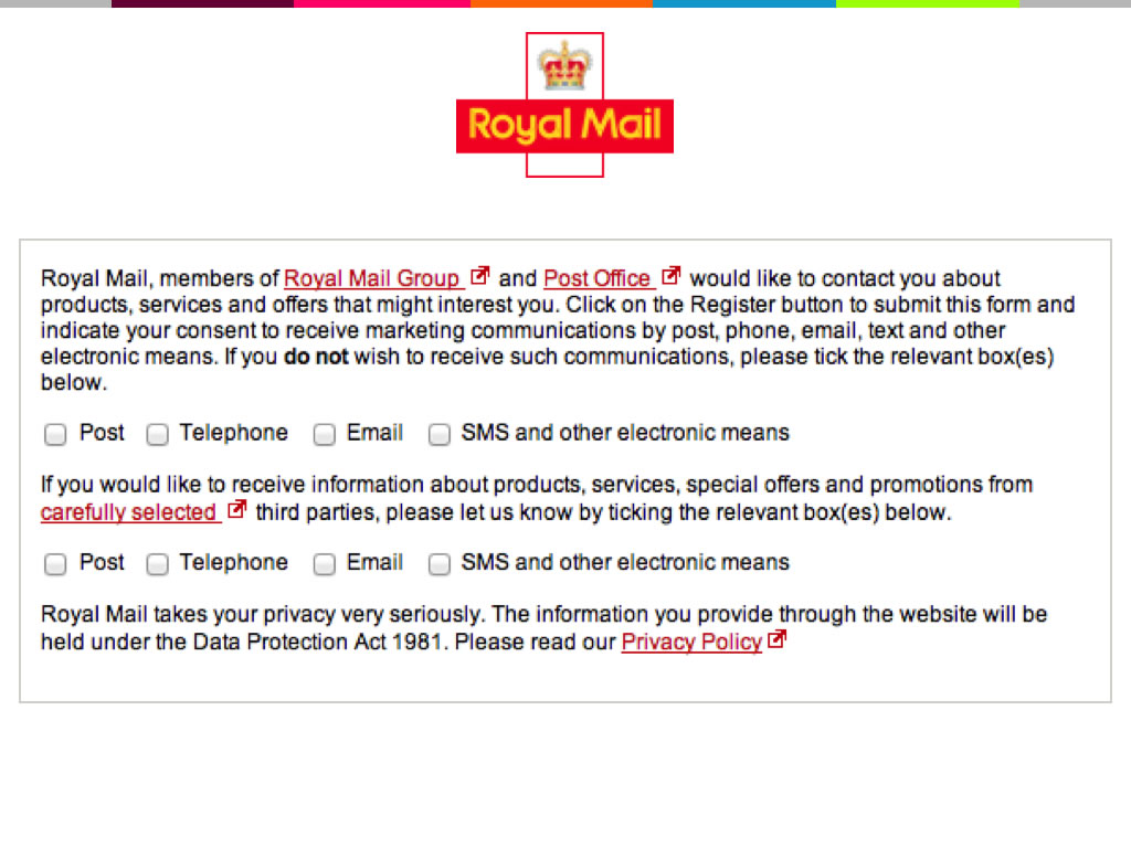
Have you ever heard of a trammel net?
It’s a type of fishing net that is made up of two layers of different types of net. The fish – or your user – can either get caught up by the first layer, or the second layer, or they can get stuck between the two. They’re banned in most kinds of commercial fishing, but it seems you can put them in your UIs without any legal repurcussions.
Here’s another approach which you can find on the Santander corporate banking site.
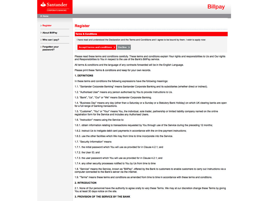
When you register you’re taken to this long and boring page of Ts&Cs. You can just click “accept” at the top there – the red button. Or, if you want, you can scroll down.
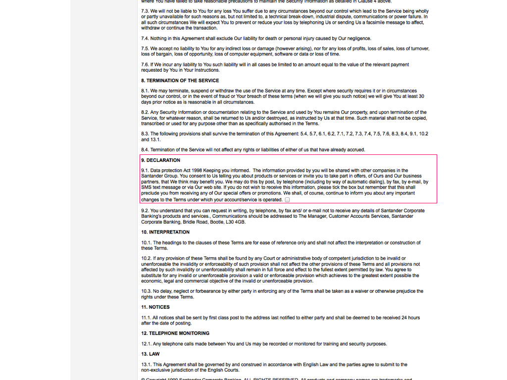
All the way down to section 9. If you’ve got your reading glasses on, you’ll notice that they intend to sell your phone, fax, mobile and address – but that’s OK because you can opt out via this tiny checkbox here.
These solutions are all kind of tiptoing around the problem, though. We could actually take this to another level entirely and get rid of any uncertainty whatsoever. This is how Quora does it:
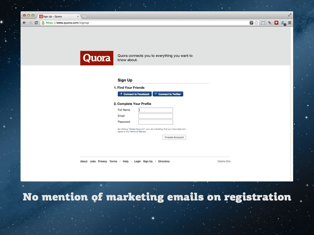
They don’t mess around with opt ins or questions of any kind. They just opt you in as part of the terms of service. This is what you see when you’re registered – if you take the time to go to the email notifications page.
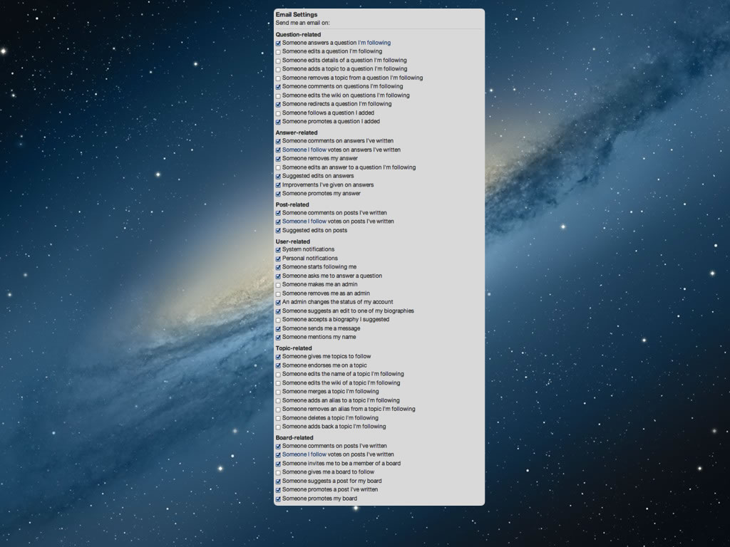
There are 47 email notifications. You’re automatically opted into most of them.
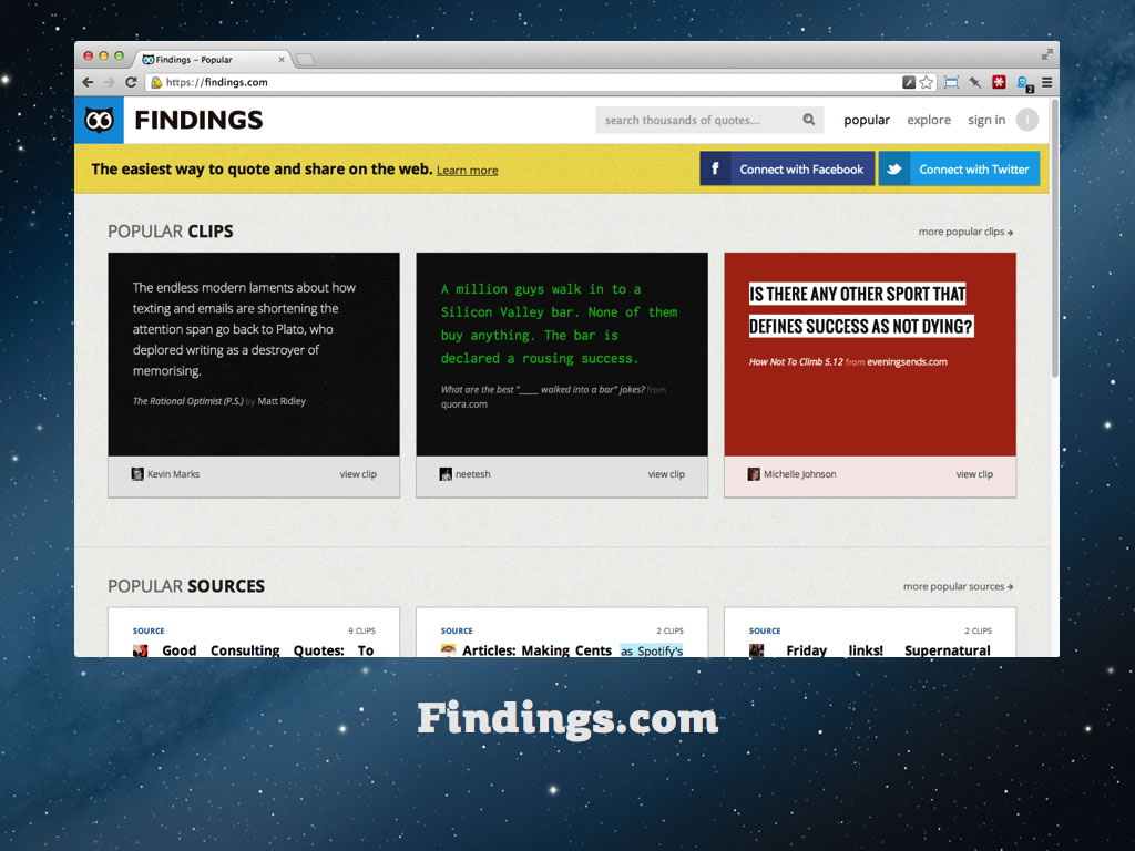
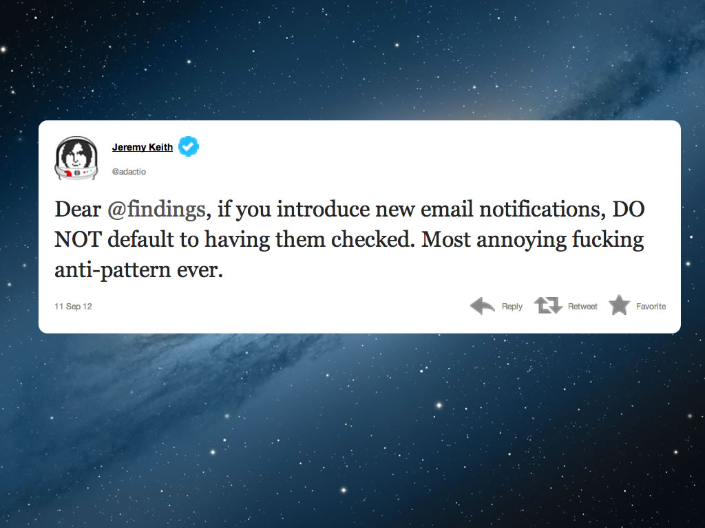
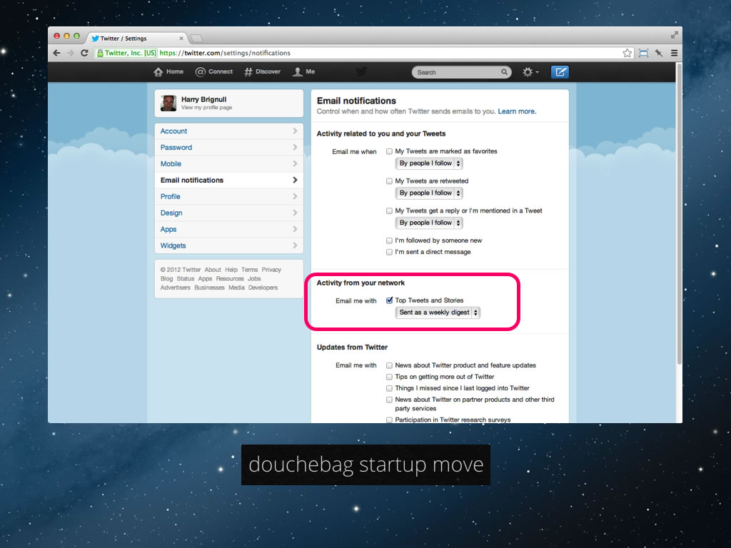
Here’s another question – imagine you’ve got a large user-base already. What do you do if you want more of them to opt in to email notifications? Well, let me introduce you to the email notification dark pattern. In September 2012, findings.com created a new notification setting – and defaulted all their existing users to “on”.
It’s a fiendishly simple solution. Why even ask when you can just flick the switch for them? Unsurprisingly, some people got pretty annoyed by this and gave them a telling off.
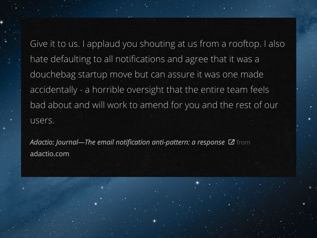
What was great is that they instantly appologised, pulled the feature and described it as a douchebag startup move.
Meanwhile, Twitter is continuing to use this dark pattern and hasn’t issued an appology. These email digests were added a while back:
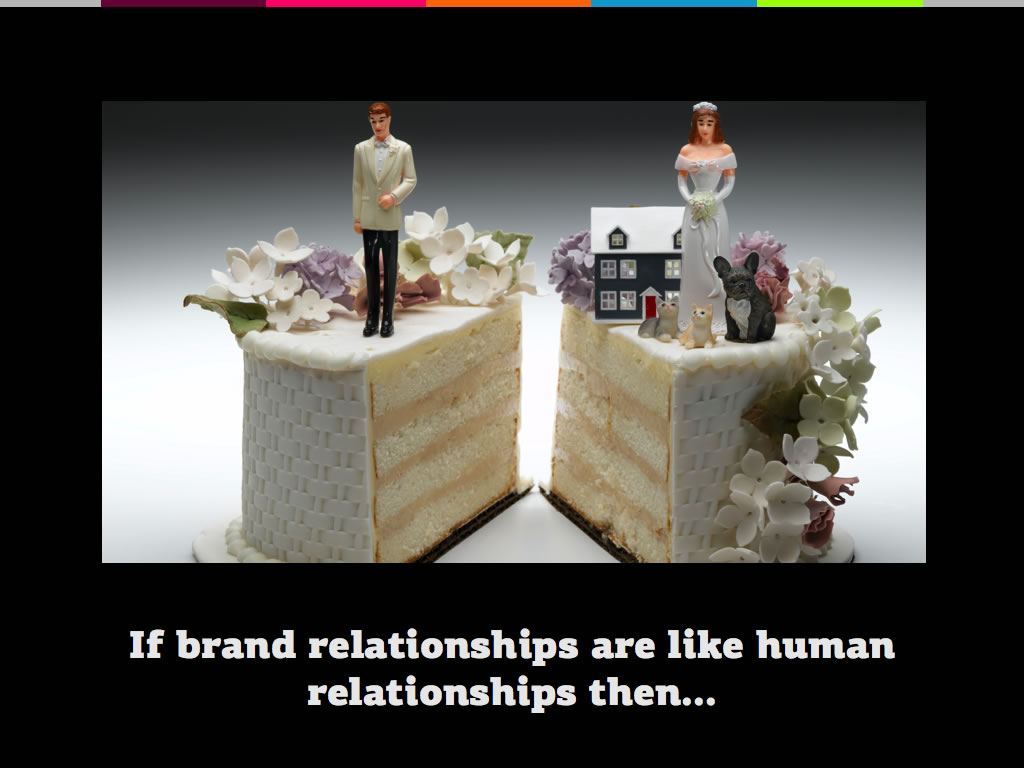
The thing to take away here is to realise that although it’s easy to play these tricks, they will piss off your users. It’s quite useful to think of your brand’s relationship with your users in human terms.
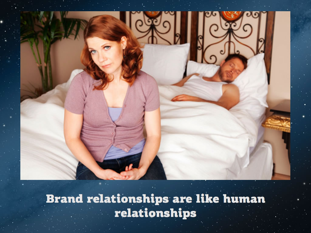
If Twitter was your other half, a trick like this isn’t that bad. It’s a bit like they farted in bed. It’s gross, it does make you angry but you’ll forgive them for it – at least for now.
If you look at app.net – it’s essentially just a Twitter clone with one unique selling point – the fact that they don’t pull any douchebag start-up moves.
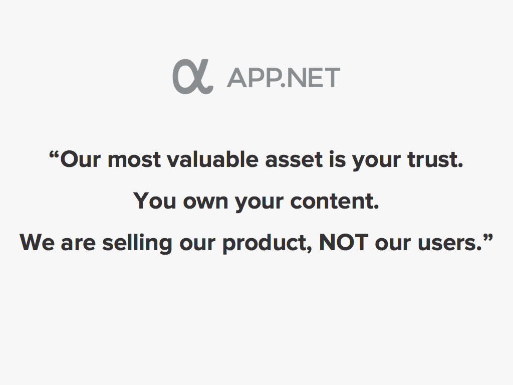
It’s crazy when you think about it – Twitter has actually given them a business model. They’re not a threat yet, but the point still stands.
Okay so let’s move on to another Dark Pattern – Forced Continuity. This is best to explain with an example. This is theladders.com:
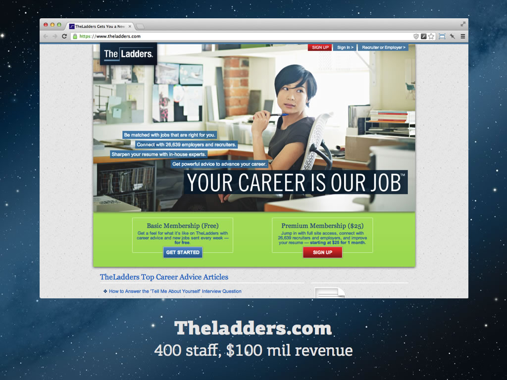
Note: All screengrabs of Theladders.com were taken in April 2013.
They are a fairly big US-based job board, founded 9 years ago. They’ve got about 400 employees and roughly $100 million dollars in revenue last year. VC funded too. What I’m about to tell you is quite hard hitting so please do check this yourself and let me know if I’m wrong. Anyway, let’s sign up for free basic membership.
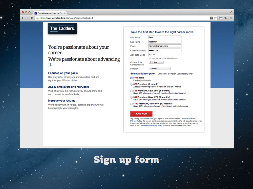
Since I’m signing up for free, there’s no point in reading this stuff, right?
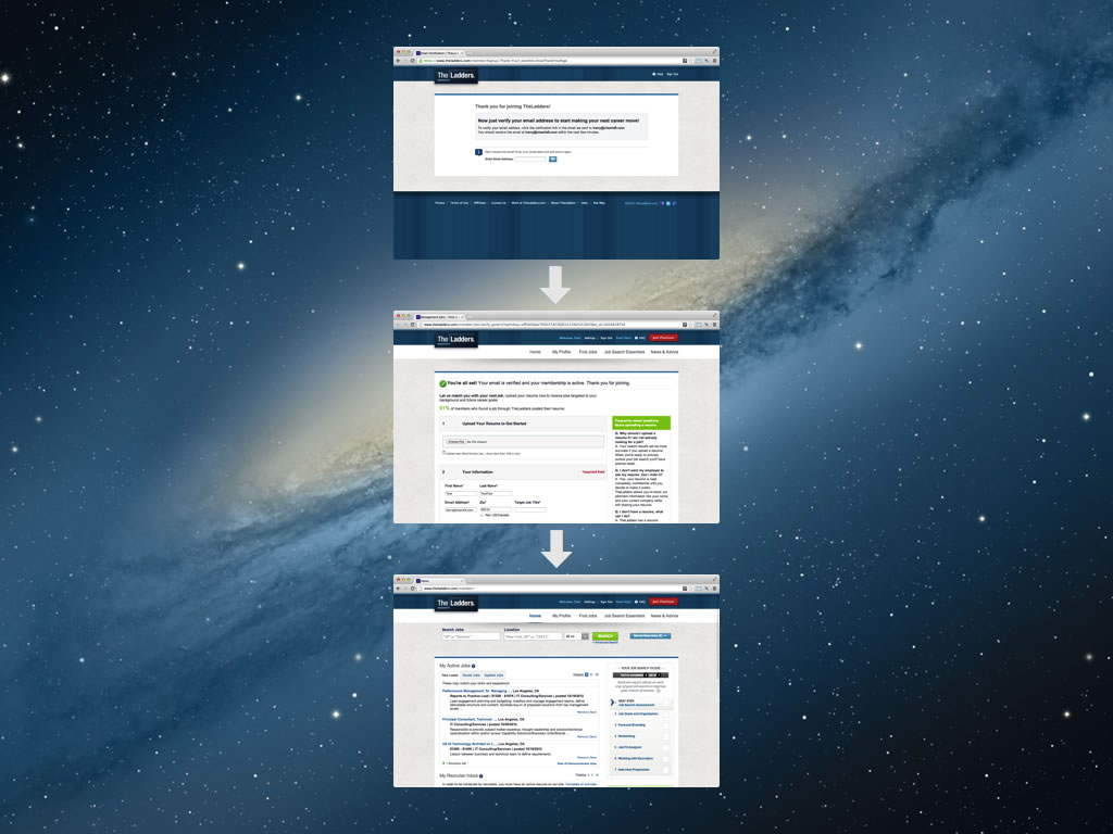
After this I’ll go through a few sign up steps and then I’ll search for a job. Here are my search results. Let’s say the second one down there looks really appealing.
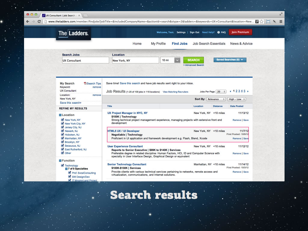
What’s weird is that when I try to select the text, I can’t. This website has disabled text selection with JavaScript. Most users wont give that a second thought, so let’s park that thought for now and click on the job title to get some more information and apply. (Edit: this talk was written in March 2013. It appears that now (July 2013) they are AB testing different versions of the logged-in area. If you register for yourself you may receive a version of the UI that does not include this copy-disabling feature).
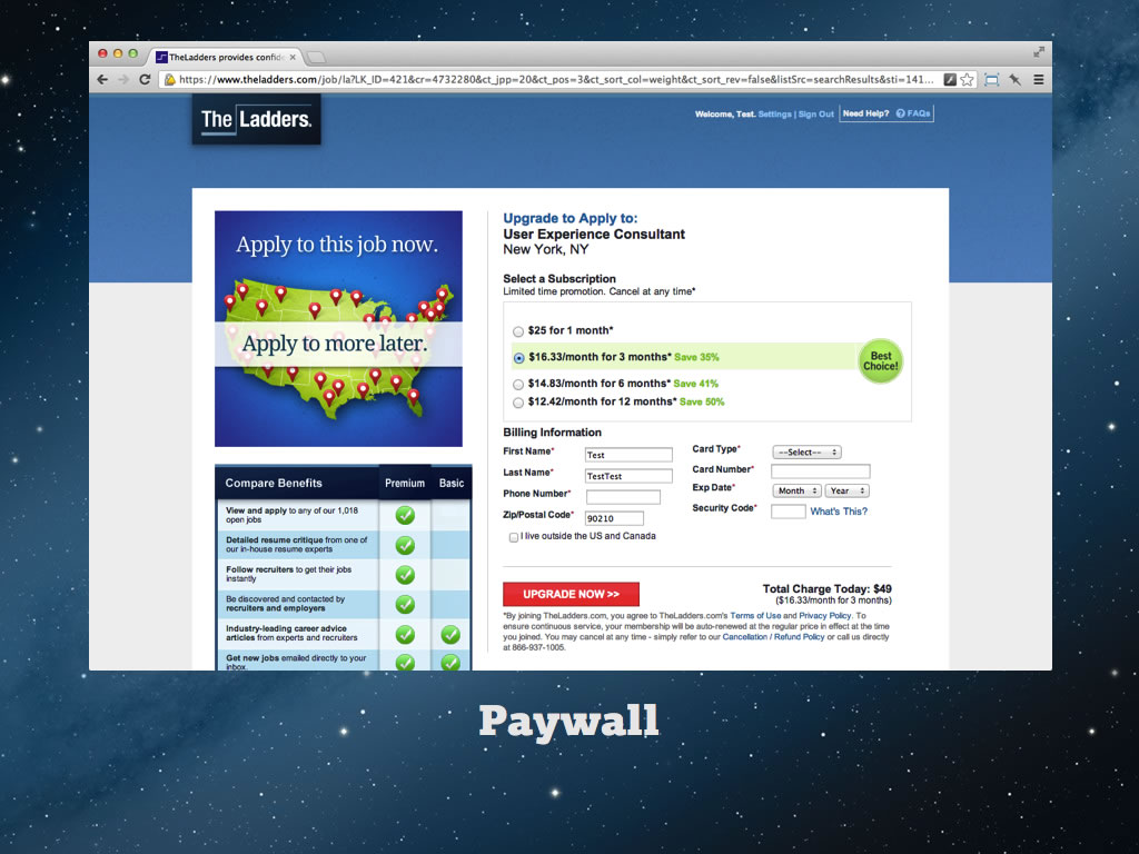
I clicked apply a moment ago and I thought I was going to see the job details and the application form. Instead I’m seeing a paywall and it’s telling me that I need to upgrade to apply for this role!
Now what I don’t know right now is that this job ad is freely available on the web elsewhere.
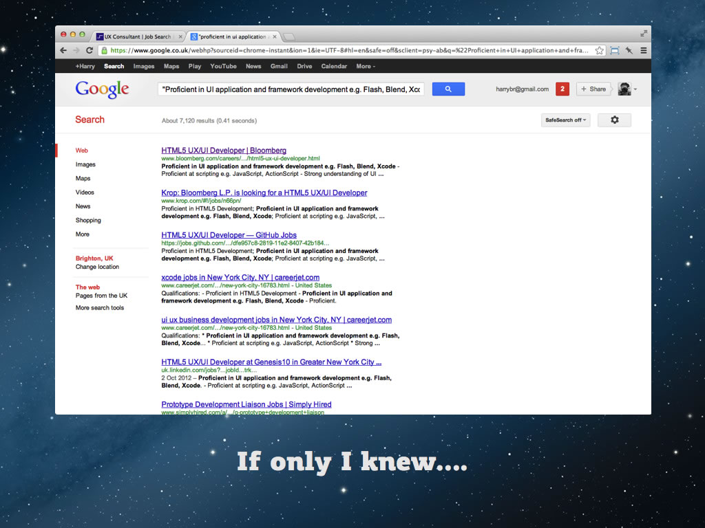
Suddenly disabling text selection makes sense. They want to discourage people from bypassing their paywall by copying the job description and pasting it into Google as a search term. They don’t want people to get to the true source. In this case the job was published on bloomberg’s careers site where you can apply free.
I haven’t taken a large sample, but from a cursory analysis it looks like a fairly large chunk of the listings behind the paywall are available free elsewhere on the web.
Anyway, I was about to naively sign up at the paywall wasn’t I. Let’s go ahead and do that. I’m going to go for a one month subscription, because that’s cheapest, isn’t it?
$25 is pretty cheap as a one of cost, compared to any of these recurring monthly fees, right? But hang on. Take a look at this grey 10 point text on a grey background right at the bottom of the page. It almost looks as if it’s been designed to be overlooked doesn’t it?
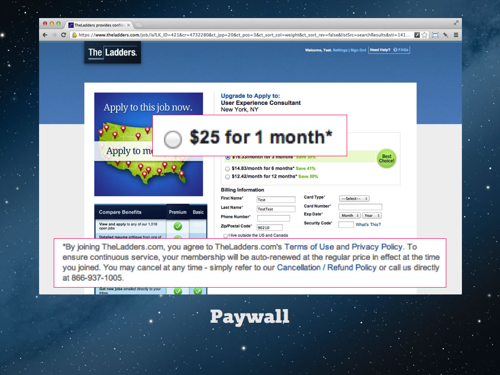
And it tells me here that the membership is automatically renewed. So by choosing $25, I’m actually going for the most expensive monthly payment – it’s not the cheapest option at all! Now once I’ve signed up, they somehow neglect to mention auto-renew anywhere prominent.
If I dig into my account settings, then go to the membership page then I’ll finally be able to turn it off – but in reality who’s going to do that? What normal person explores the account settings pages?
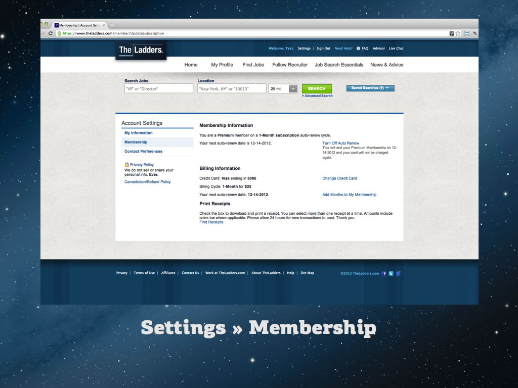
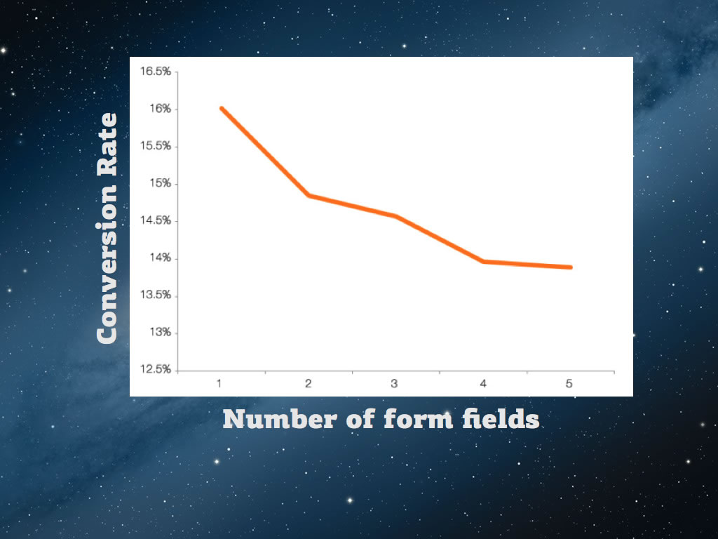
So here’s another usability heuristic flipped around. You know how your conversion rate drops in correlation with the number of required form fields? You know how that’s normally really frustrating?
Well, on theladders.com they use it to their advantage. When you click “turn off auto-renew” they don’t give you a confirmation message – they take you to this form.
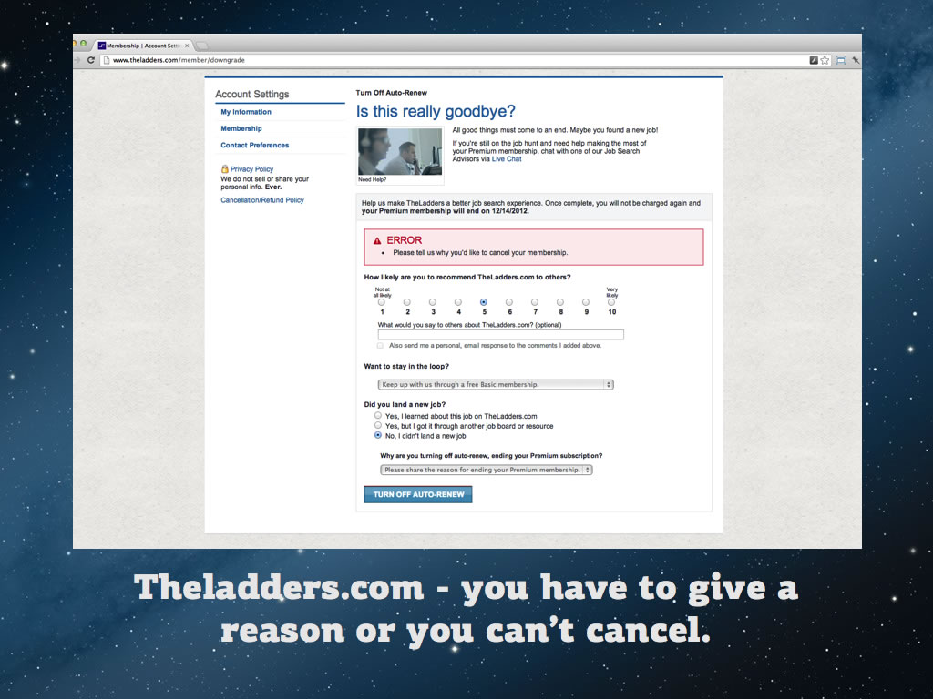
You have to fill in every single field or your cancellation is not accepted. It’s high friction by design. Very sneaky stuff.
Going back to our metaphor with human relationships – if in the previous example Twitter was just farting in bed. This example is more like having an affair.
Affairs only work while the secret is kept. When the secret comes out, the breakup happens. JustFab.com are using a similar trick:
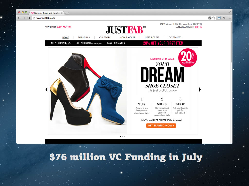
They are a VC funded ecommerce site. Users think they’re buying an item but they’re signing up for membership at $45 dollars a month. If you go to the terms of service, it explains that you’ll be automatically enrolled in the JustFab VIP membership when you buy an item. Cheeky stuff.
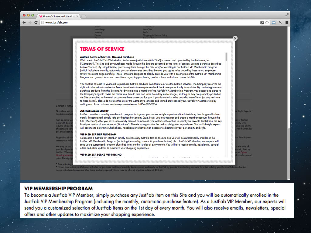
And their users seem to agree with me – apparently they have a class action lawsuit pending. Next.co.uk also does something very similar. On one of the checkout pages it asks you if you want the free next directory.

It even pre-selects the radio button. Sounds OK right – who doesn’t like free stuff? But let’s look at the small print.
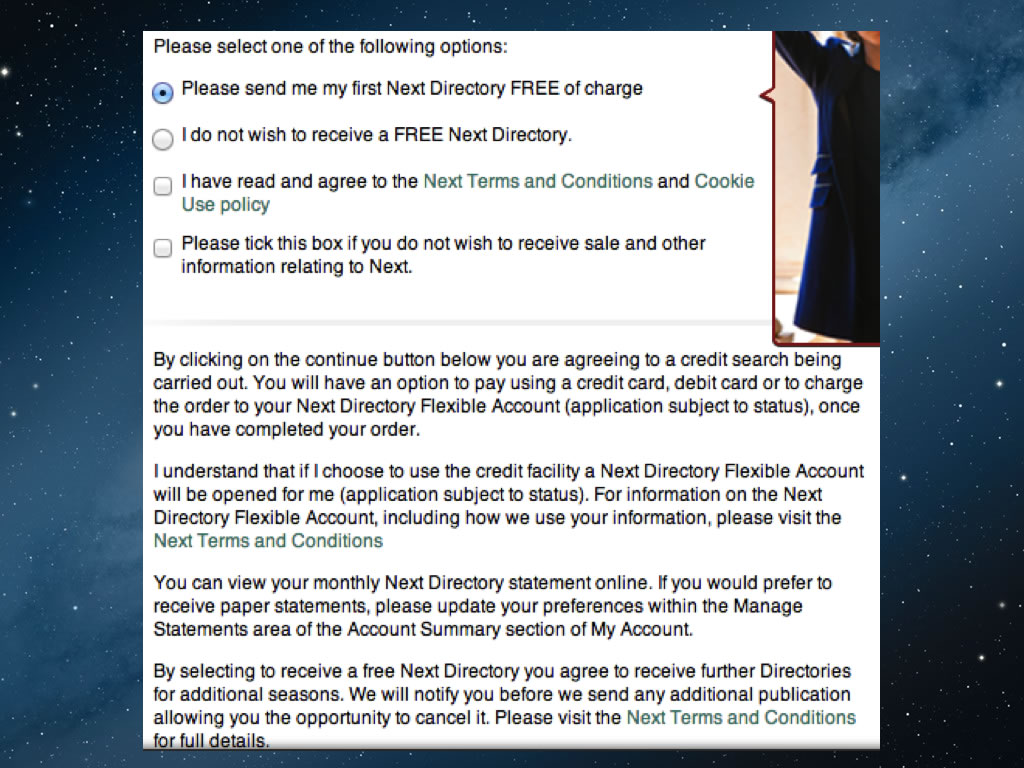
Here they explain that by proceeding with the purchase, you’re consenting to a credit check and having a Next.co.uk credit account opened for you. Then they explain that after the first free directory, you’ll be charged for all subsequent directories. Most stores give away free brochures – I did a bit of digging and it turns out that these guys publish four a year and charge you £3.75 each! As you can see, they don’t mention this anywhere at the point of sign-up.
Another related dark pattern is the Roach Motel. It’s where you make it easy to join, and hard to leave. Bank accounts are a great example of this. For example, it’s very easy to open a savings account but it’s a huge pain in the ass to move all your money out of that account and into another, then close the empty account.
Most UK savings accounts come with some sort of bonus period of high interest, which then gets slashed after a year or two. Funnily enough they don’t make much effort to remind you about this.
In other words, they’ve combined “Bait and Switch”, with “Roach Motel”.
According to moneyfacts.co.uk almost half of all UK savers have savings accounts that pay less than 0.5% interest. That’s lower than inflation. We can only guess how many millions are being made by banks in this way. It’s crazy. There are actually services out there that specifically aim to destroy this dark pattern. This is savingschampion.co.uk:
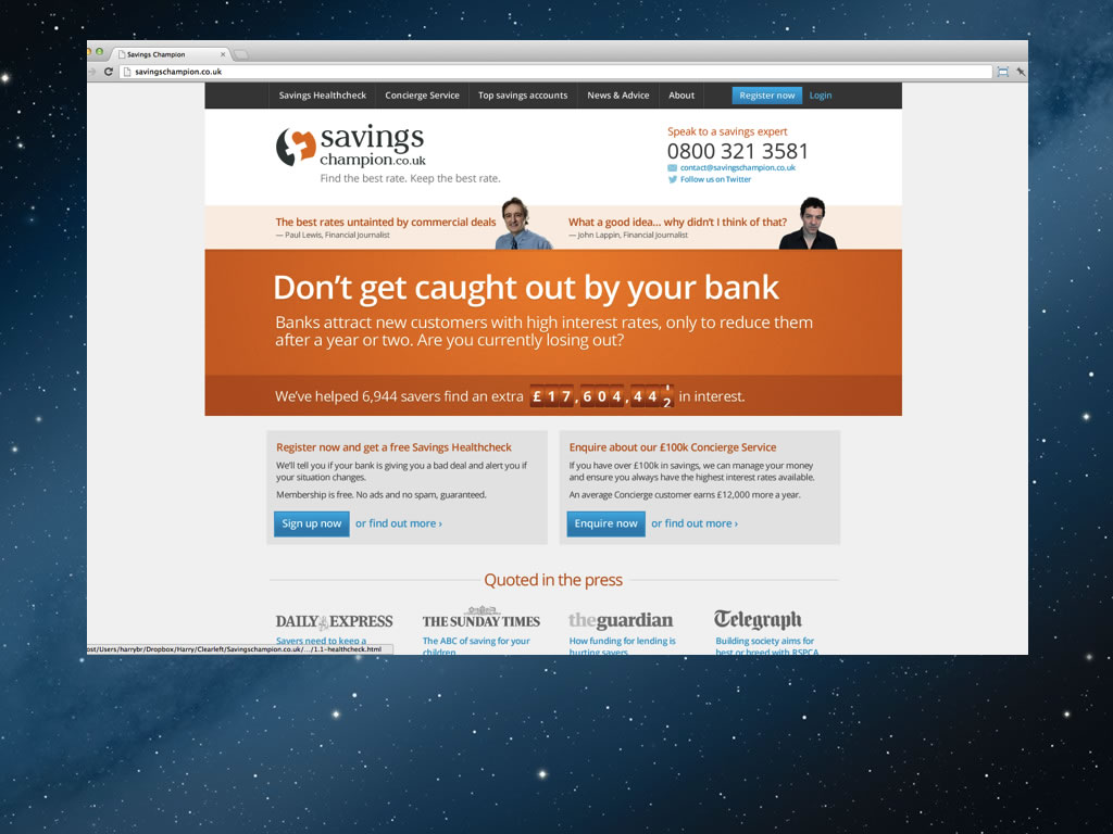
Basically you fill in a form telling them what bank you’re with and what account you have. They’ll then then notify you if your bank ever cuts the interest rates and they’ll tell you what account to switch to. What’s funny is that this simply shouldn’t need to exist – it’s an anti-dark-pattern service!
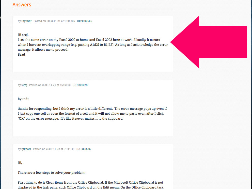
Finally, here’s the last pattern I’m going to talk to you about: Midirection. Let’s imagine you’ve done a search for “cannot empty clipboard in excel” and you find yourself on experts exchange. This is actually quite an old example but I like it.
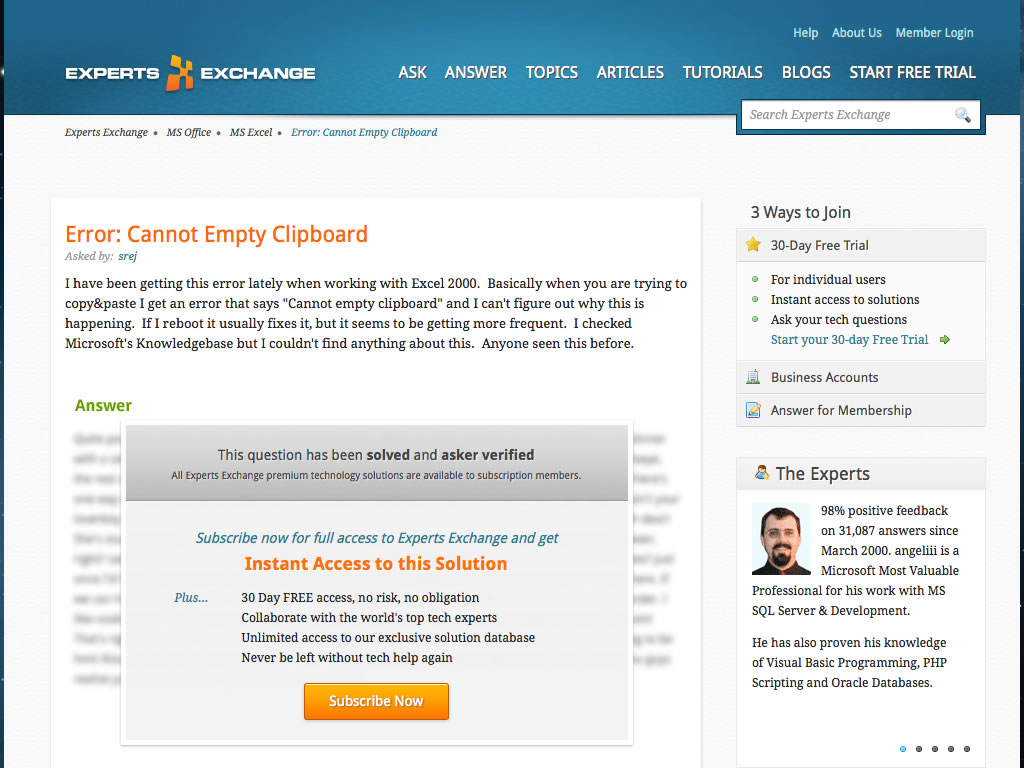
It looks like the answer is behind a paywall. In fact it’s just way, way down the page – right at the bottom.
This trick gives them an SEO benefit while simutaneously tricking users into subscribing. They’ve actually been doing this for years – since 2007 in fact. In 2008, stackoverflow was launched. This was their unique selling point:
This is such a good case study showing what can happen if you systematically use Dark Patterns as part of your growth strategy.
Experts Exchange could still be a dominant force today, but they’re not. They got greedy, they used Dark Patterns, everyone got annoyed with them and migrated to a friendlier, more ethical competitor.
When you look at your customers in aggregate, it’s easy to be very detached and impersonal about it. To understand the reality of what it’s like to be on the receiving end of your product, you have to zoom in.

Good design – and good business – is all about empathy with our fellow humans. In fact it’s not really limited to business – it’s society as a whole. It’s what defines us as human. To understand the true impact of your designs, you have to work at a human level of focus. You have to see the whites of their eyes and their facial expressions. That’s really the whole point of this talk.
At the end of the day, you should evaluate what you really want from your customers. Do you just want them to just use your service, or do you want more?
Personally I think usage alone is cheap. A good brand is liked. A great brand is loved and respected. I hope that today I’ve shown you’ll never reach that point if you use Dark Patterns.
This was so interesting, I actually read every word (even with it’s length). I never thought about the inverse of usability. Very well done.
I got on Experts Exchange at the very beginning, when it was free, and was supposed to be “Grandfathered in” when they went monthly pay. However, this grandfather was set on an ice floe! I logged in one day and they said “Nya nya nya, now you have to pay!” Consistent with their “Dark Pattern” mentality I suppose.
Thanks for taking the time to list all the examples with all the screenshots.
great post, lots of good examples!
wow, please bad web companies, stop doing this stuff!
Great post, and a subject I’ve been thinking a lot recently!
Yesterday I had the nightmare task of booking a simple flight… I dare you to try and go through the process on Ryanair (up until cc, unless you really want to jet somewhere!) and prepare to be horrified at every step of the way: https://www.ryanair.com
It’s a purposeful UX nightmare, a puzzle that you have to tick and untick *just* the right selection of boxes to not end up with added extras and unwanted emails.
Well written article, thank you for sharing.
(“they used Dark Oatterns” -> “they used Dark Patterns”.)
This post was so great, tear came out my eyes
FrankandOak.com recently duped me with the exact same tactic as JustFab. goddamn them.
http://en.wikipedia.org/wiki/Goodhart's_law
Excellent post. We just made our first dedicated UX hire to specifically focus on making our data and settings more transparent to our customers and give them better control over our app. We have very strong relationships with our customers and have seen the benefits of honesty and simplicity over time.
Well written. Thanks.
Great examples, Harry. The NHS example is interesting, and the medical field is full of examples of bad metrics, from nurses being fired and under criminal investigation because of extremely high death rates (they took the bad cases others avoided) to doctors prescribing longer hospital stays to a healthy patient (so the patient’s family don’t give a bad customer satisfaction rating). Bad metrics are worse than no metrics.
The “Dark Patterns” link is screwed on account of a missing = after the href. :(
(Great article. This comment form’s UX is terrible, though.)
Nice walk through history, hopefully companies will learn from it. Watching experts exchange become popular, get contaminated with those Dark Patterns, and die as a result was quite satisfying in the end. In their particular case, their behavior was bizarre – they were alienating their actual experts, who provided all their value for free. SO obviously understands that the average user is going to be involved in both questions and answers, and you can feel the respect for the people that use the site – who also make it great.
Thanks for the read. BTW “Dark Oatterns” sounds like a breakfast cereal.
Very insightful to see what is at stake when designers/developers try to make things ‘subtle’. These are pressing matters in UI and UX design and hope that your efforts are being heard more and more everyday.
I can understand meeting business objectives is a must in some situations, but it’s hard to draw a line of what’s wrong and right in a digital and online world. Could there be a best practice set up for future designers and developers to adhere to? I mean, doctors have a code of ethics to follow, do we have one? (Clearly I don’t know if one exists, if there is please let me know!). And if so, do we have to follow it?
I can see that perhaps some people may try to justify their decisions with design philosophy, like minimalism; minimizing the amount of actions or buttons to see, or marketing ploys; be simple and straightforward.
I find this is a monetization scheme for private interests, totally not for public’s (the users) interest. I hope there is someway that we can see a change or a higher awareness for designers, developers and users! There seems to be a blurred line between business and design ethics, where objectives are traded off between the human element and “can I make a dollar more if I did this instead”.
Great article, and thought it was really well researched! Keep it up!
I was suckered into Experts Exchange the first time I found them. They got me on the hook for a month of subscription ffes. I admit that one was sneaky lol
great read – love your examples
Wow, that’s a long and interesting article.
I even learnt something about fishing.
I MADE IT TO THE BOTTOM!
Awesome post, thanks for splitting up appropriately to your talk and including all the slides as well… Essential read!
Happily, in iOS 7 the Advertising option is actually found under “Privacy”.
Still phrased as “Limit Ad Tracking” though.
I’m not sure savings champion making you give them your financial details before they’ve verified your email address is a good idea. What if someone puts in the wrong address and someone else ends up with access to their data?
Amazing post Harry,
Thanks for restoring the balance of force to the people,
may the force be with you,
and those worship the “dark pattern” beware!!!
Very interesting, I always believed that manipulation will bite you back one day.
Very interesting read and yes, I recognise a lot of these examples, unfortunately from experience! Once you realise you’ve been had it leaves a bitter taste and an instant loathing for the culprit. Facebook, Instagram, Twitter – they’re all guilty of using Dark Patterns and you really have to be aware of what they’re at. Great read and thanks for sharing.
Now should I tick the box below? :-)
Pingback: Great talk on dark patterns
LinkedIn do this. Many friends sent out massive spam to all their contacts when they connected their Gmail to linkedin.
Best thing I’ve ever read this year.
Thou the reality is that most of these tactics are pushed by marketing departments and I toked part in some of the so called “creative ways” to sell meetings. They always turn to bite them in the ass.
Nice article. I did design work around an anti-pattern style site in the early 00s. The sites’ business model is no longer valid, but the guy who owned it is a millionaire a few times over. I’d like to think that with the web optimised more for social it is less useful to go for the quick buck (people will publicise a poor experience). That said, given the scale of the web, you may only need a small fraction of a market to make a site valuable, and there is no shortage of new suckers/victims.
Also the idea of dark/anti-patterns exists in multiple ways. For example, new materials that are made to look like recycled plastic or cardboard so as to connote environmental responsibility.
And to some extent many brands are essentially anti-patterns, in that they are collections of signifiers that manipulate us to perceive a product or service to be something more than what it is. That’s not always the case, but none the less, many people/companies go a long way on hustle and chutzpah.
Pingback: Dark Patterns: So erkennst du absichtliche Design-Unarten am Beispiel von iOS » t3n
Fascinating! I managed dell.com back in the late 90s and evangelized the use of Nielson’s heuristics for the website redesign. The results were dramatic improvements in customer satisfaction, close rate and increased average sales total. Fast forward to 2013 and I’m a marketing consultant, working with software companies and integration providers. The coolest thing? The golden rule ends up being the best basis for business, as well as human relationships. After all, people do business with people.
Loved this, thank you
After my own infuriating experience with Network Solutions, I put together a piece outlining the dark patterns in play throughout the ordering process (31 screen shots of fun!). I see a lot of similarities to items you’ve identified throughout and hope others will take up the effort of detailing their own bad experiences. Mine: http://blog.adrianroselli.com/2012/11/network-solutions-and-dark-patterns.html
I’d always thought Quora seemed sleazy from their compulsory “register to read” policy. Now you’ve confirmed it, and I will no longer feel guilty about bypassing their paywall dialog with Chrome developer tools rather than registering.
Excellent article. I really liked how you started with us doing something interactive!
Great article.
Match.com very bad with their automatic subscriptions, no notification that they’re about to do it, and it’s by no means obvious at the time of sign-up that there will be auto-renew. Wouldn’t surprise me if one user in three were caught out this way.
Quite common is to uncheck a “spam me with offers link”, only for this to be rechecked if you’ve made an error elsewhere in the form.
Excelent article!
Although I am usually very good at spotting traps, I saw a couple for the first time here.
As a text-book case of dark patterns, you may also want to have a look at downloading any free application from download [dot] com (aka cnet)… You’ll have to bypass three or four hidden checks in “advanced” settings, and twisted statements in order to avoid installing their browser add-ins and toolbars. And of course once you isntall the toolbar (which spies on everything you do) it is almost impossible to fully get rid of it…
Pingback: The Light and Dark Side of Usability by Mobility Labs Inc.
Wow. Thanks for this. I’ve had the ‘auto-renew the most expensive version of the membership thing’ happen to me from Lynda.com. But I just setup a calendar reminder to opt out the day before the renewal. XD Also, I’ve turned off ad tracking from my iphone as well. Thanks for putting all this together, it must’ve taken a sh*tload of time and effort to collate all this.
Great post!
This is similar to how TV companies and ISPs bait and switch too. On every site I’ve been to it’s virtually impossible to find the actual monthly cost you will pay after the compelling “intro” period ends. They try and hook you then charge the heck out of you. That’s not how I like to be treated as a customer.
CorelDraw has an “autorenew the most expensive version” as well. They also make it really unclear how you unsubscribe from autorenew. I had to go into the account and change it from autorenew to “on demand.” I then sent them an email to see if that was sufficient, but with no reply. I ended up just waiting for the next month to see if I had correctly unsubscribed. Fortunately, I had. Definitely a douchbag move.
Brilliant work. Sharing to the world! And remember the first dark pattern? Trying to quit AOL!
Due to these shady patterns and subscription plans, I nowadays just use my Visa Electron to subscribe to services online. It is linked to a bank account with balance of 0 euros so when these sites try to sneakily charge me they can’t. I’ll just need to transfer money on that account when I am buying stuff. Adds some extra hassle to the process, but this way I wont get any surprises.
Pingback: The User Experience Three. Handpicked 07/25/2013 | UXPin
***claps hands*** Bravo, bravo, bravo!!! Unfortunately, most people that are reading this are those that already know a lot of the ins and outs of these “dark patterns”.
So yeah… this should be spread to everyone everywhere, whenever they simply log on to “the net”… gotta protect them consssumerzzzz.
Great article!
Great post re UX design, Harry. Very informative, indeed. This may be naive of me but I don’t get it why businesses would attempt to manipulate the online interaction to their own advantage. But then again, I guess people do it all the time in face-to-face interaction. When do we get transparency?
Also love the term: “Dark Patterns,” soon at a screen in front of you.
Thanks for sharing.
Pingback: The Shady Behavior of Web Services | ACROSS THE FADER – ORG
FrankandOak.com aren’t as bad as JustFab, they spell out rather clearly that you’ll be paying for a curated service, although I still don’t like what they do.
Has anyone ever visited NakedWines.com? Their whole site is designed to trick you into an auto-renew membership, then shame you for five whole pages before letting you get out of your membership.
Very informative. Though we have seen these – most commonly it is ignored with some amount of irritation and frustration. The structured description and the name “DARK PATTERNS” is very interesting. Great work!!
Great article. Not sure why you “created” the term dark pattern, since people’ve been calling these anti-patterns for awhile but who am I to judge. Thank you for your time and sharing your knowledge with us.
Pingback: Avoid Dark Patterns for Short Term Gains | Barctic
This article brings out the one of the most annoying thing about internet.. that has caused users to not trust anything beside few sites. And give all other sites a trash treatment.
In reply to Anon: the term “anti pattern” is used in UI design to refers to design mistakes. Dark patterns are a different class of UI design pattern. They are intentionally manipulative. I hope that clears things up.
Pingback: Weekly Filet #122: Evolution of the Duckface. And more.
This is the best article i have read this year great content not overflooded by useless links (dark pattern for seo)
“Dark Patterns” — fantastic term for it. I’ve come across this idea before while working but never had a term for it. Great to finally be able to give it a name. It worries me when people suggest it…it makes me wonder: “Wait, doesn’t this kind of stuff piss YOU off as a user though?”
Great article. Thanks!
Please note the correct capitalisation for ExpertSexChange.com
Great read! Ryanair immediately comes to mind while reading this white things in UI such as an insurance opt-out in the middle of the list where you’re supposed to tell the insurer(which util this point you thought wasn’t mandatory and suddenly seems) which country do you live in. There, amidst something like Norway and Portugal, you have a “country” called I-don’t-want-to-take-on-this-insurance. This happens then throughout the whole flight booking process. They’re really agressively playing against you. But then again, it’s part of their business model to charge on any slight irresponsibility a user commits, and somehow, it’s ok, when they chare you a meal price for a flight…
Pingback: The Dangers of Dark Patterns | distilled
You just reminded me of the £3.75 Next tried to steal from me – I returned the over priced catalogue and got a refund out of principle but I haven’t shopped with them since & I am probably target market.
Excellent article! All examples were great, except the Apple argument. There are subtleties that you may not be considering. Fact: any web company can track anyone or anything they are able to without legal repercussion. Apple is aiming to help create a system where the user has some control in this, and is doing it ahead of the government sticking their nose in (and possibly making things worse.) Without pointing out that “You are being tracked like crazy right now, but we want to help create an ON/OFF switch for you, and help coerce other companies into using it”, Apple has to convince their advertisers that they won’t be missing out on anything by joining up with this new ON/OFF switch choice, and will actually help create goodwill with their customers. And, if Apple made it easy for us to click NO, it would result in no advertisers choosing to join this new ON/OFF system. So, they are purposefully hiding it for now, to get everyone into the ON/OFF system first, and then later letting us know we have the choice to turn it off.
They need to get everyone, including the advertisers, onto the new system first, and then they can tell us we have a way to turn it off. If they don’t first accomplish that, then we NEVER have a way to turn it off. So, you are suggesting that Apple is being evil, but I am suggesting they are trying to be the good guys.
And no, I do not work for Apple.
Will the ultimate alienation that using dark patterns creates with customers cause companies to change their tactics and abide by the Golden Rule? Your thoughts?
Using disposable emails and temporary credit cards helps protect you in case you overlook a dark pattern implementation.
Pingback: Top posts of 2013 | 90 Percent Of Everything
Pingback: Top posts of 2013 | DICKLEUNG DESIGN 2013
Pingback: The slippery slope | 90 Percent Of Everything | beta robbyedwards.com
Pingback: Network Solutions and Dark Patterns | Adrian Roselli
Pingback: Dark Patterns | Ken Zinser
Pingback: The User Experience Three. Handpicked 07/25/2013
Pingback: Seven UX dark patterns that influence your decision-making - RMA Consulting