A paraphrased transcript of my talk at UX London 2012.
Do you want to know what interests me about our industry? It’s the fact that we always talk about the importance of making mistakes, and iterating, and learning from our failures, but we never actually share real stories about our mistakes and failures.
It’s this weird taboo. We’re obsessed with it – yet we never share the details. All too often we brag and we tell impressive stories, as if we’re in the locker room at school. It’s not a great situation for the young and inexperienced. It tells them that something is really important, but it doesn’t equip them with an understanding of what it’s really like to go through.
I think this is wrong. We can help each other a great deal if we get over this taboo and start sharing real life stories of our projects.
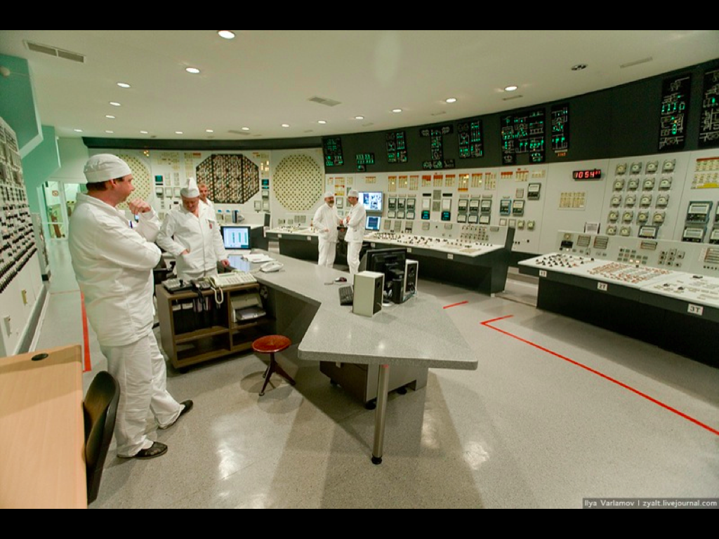
Other industries do it. In game design, articles are regularly written on this subject. In safety critical systems, they’re obsessed with it. We need to take their lead. And since I’m here right now, I may as well go first.
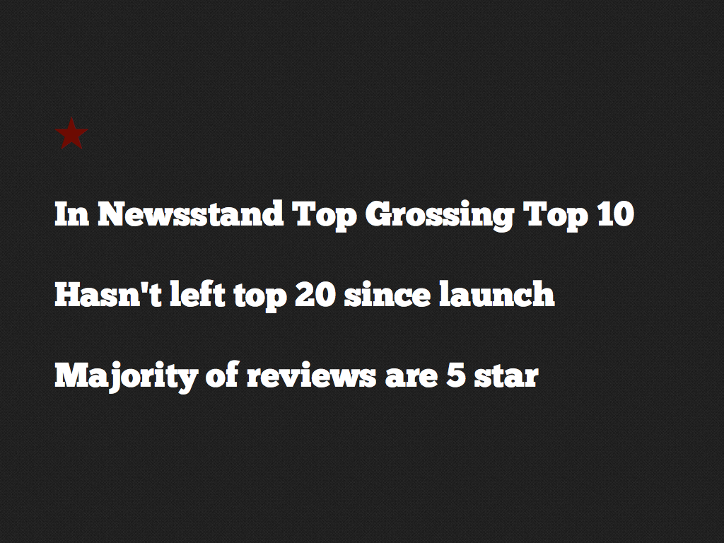
Let me tell you the story of an iPad app that I worked on for a magazine. As you can see (above), this story does turn out good in the end- but that’s not what I want to focus on. I want to focus on the bits that people would normally gloss over when giving a talk like this.
So, have you ever had a project start where your boss comes in the room and says “Hey we’ve won this great project, you’ll be the lead on it. Here’s the company.” …and you have absolutely no idea who they are? It’s a bit of a sinking feeling, like – “Oh no! I’m already out of my depth, and the project hasn’t even started!” This is what happened to me with this magazine – The Week.
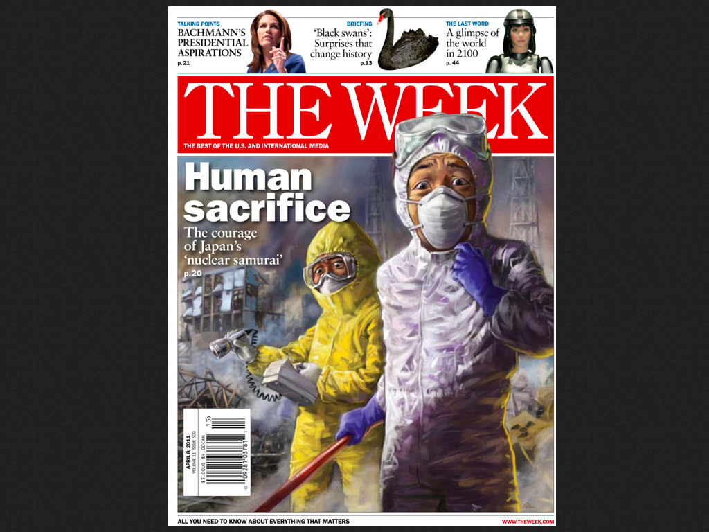
It’s a very successful UK magazine. I’d never heard of it. Somehow, even though it’s been around since the 1990s, I’d never even seen the cover before.
To start the project, We carried out about 20 hours of stakeholder interviews. Everyone from the CEO to ad sales to editors. One of the questions we asked was around the challenges we faced on the project.
We asked them “If this project goes wrong, what’s the most likely thing we would have done to make it go that way?”
They gave us some really interesting answers. We learned that they’d tried to make this app once before, but it didn’t feel enough like the print magazine, so they axed it before launch. We were being brought in to do it right.
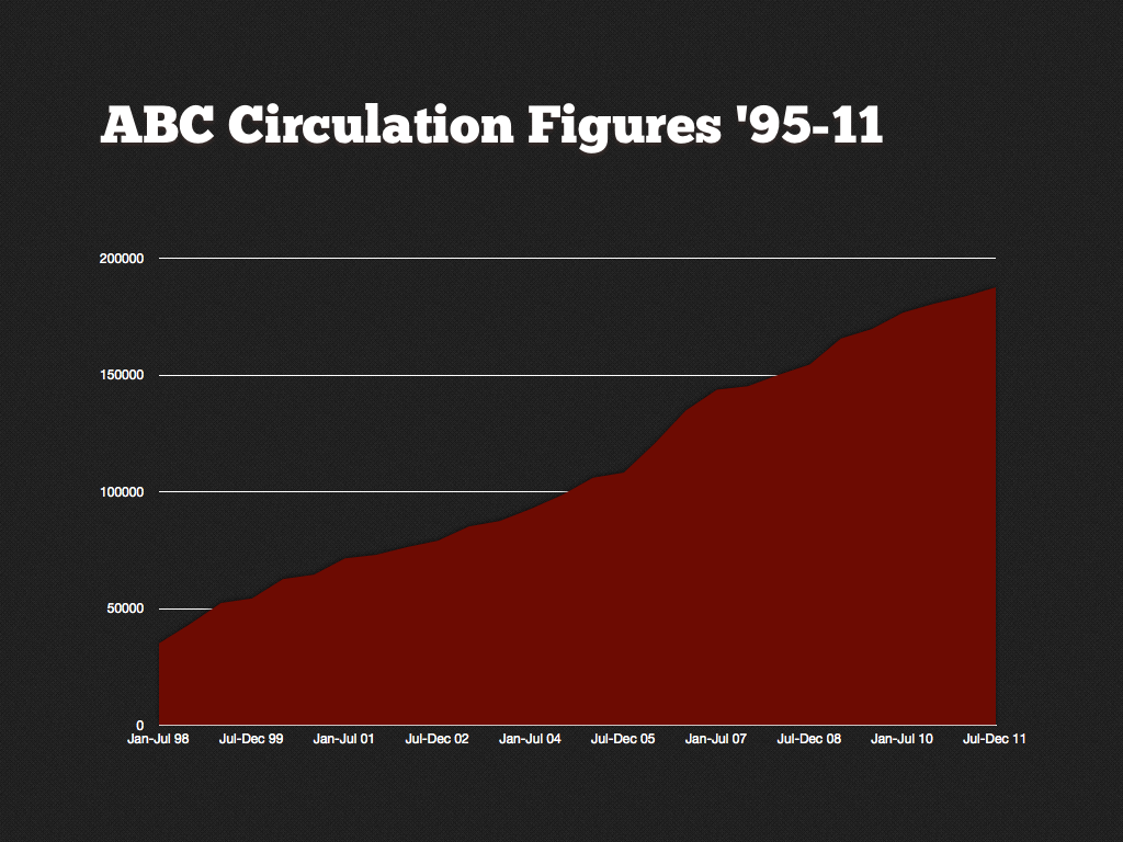
They showed us their adoption graph, and explained that although they had nailed it print, they didn’t know how to translate it onto iPad. As a result they were massively conservative. We started to suspect that if we didn’t design something that the stakeholders liked right off the bat, we wouldn’t even have the chance to prove its value through usability testing. So it was against this backdrop that the stress began to kick in.
At this point, all the evidence and opinions stated that we needed to design something that felt like the print magazine. For example, they asked for something that could be switched between easily. So that if you’re reading the politics page in the print mag, you could later on find it on you iPad and continue reading without any fuss. So we started work on a design that would tick all their boxes, with a plan to make a simple keynote prototype, and then to lobby and basically preen all of the stakeholders to get their backing. With this backing, then we’d work with our dev partners to build a real iOS prototype and take it through two rounds of usability testing. So let me tell you about how we came up with the initial design.
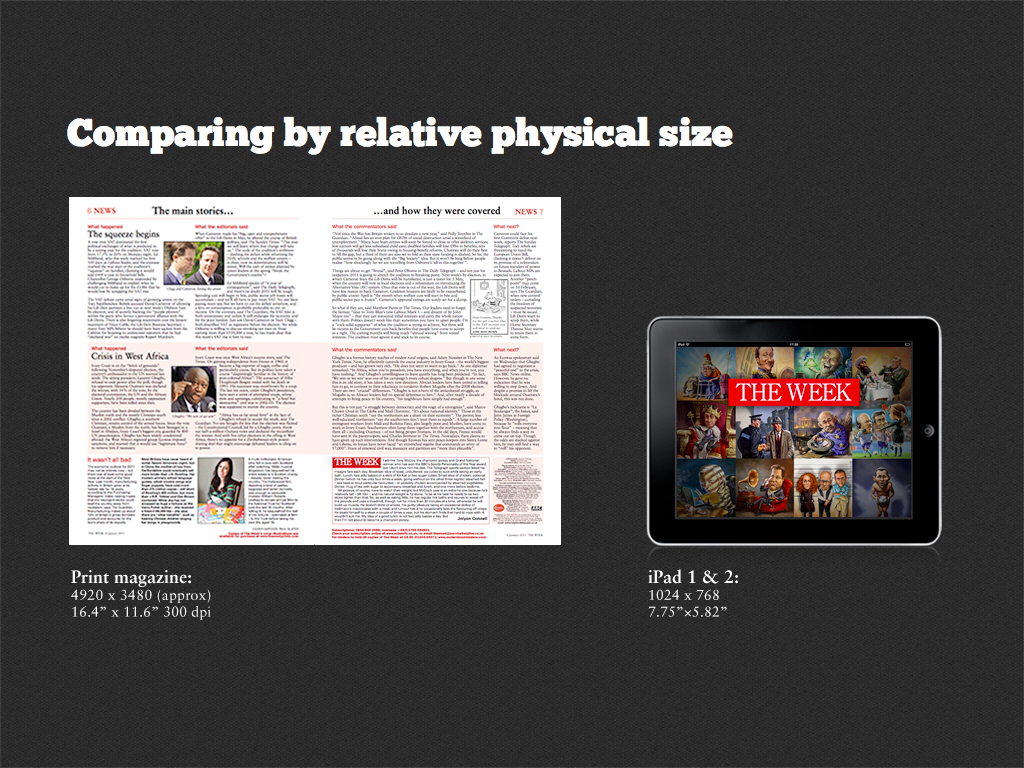
We knew the print magazine contained some sort of magic recipe that was making it so successful. And we also knew that it was physically a lot bigger than an iPad, even more so when you compare on display resolution rather than physical size. You can only fit about 500 words on an iPad 2 screen unless you make the text ridiculously small. I know the iPad 3 has a way higher resolution, but let’s face it, people aren’t going to be chucking their iPad 2s away in a landfill just yet. On a print double page spread, you can get almost 2000 words and a few pictures thrown in.
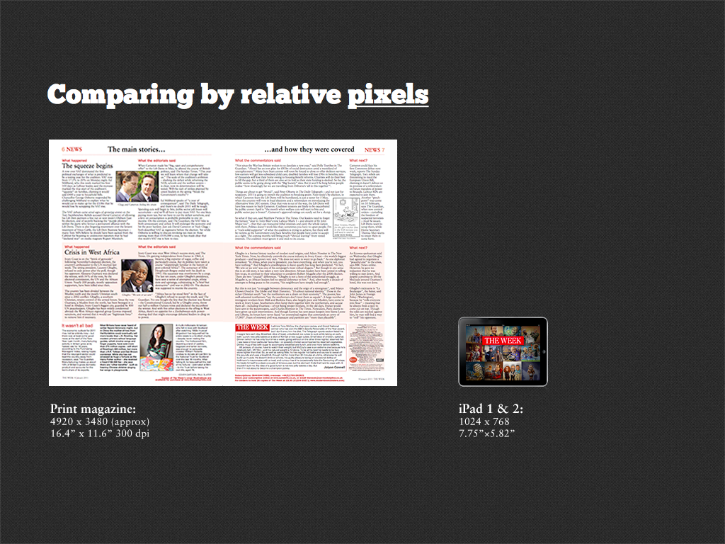
So on the one hand you’ve got this lightweight, easy to complete paper magazine with minimal navigation. On the other hand you’ve got this heavy iPad with a tiny viewport, requiring loads of navigation. It was worrying.
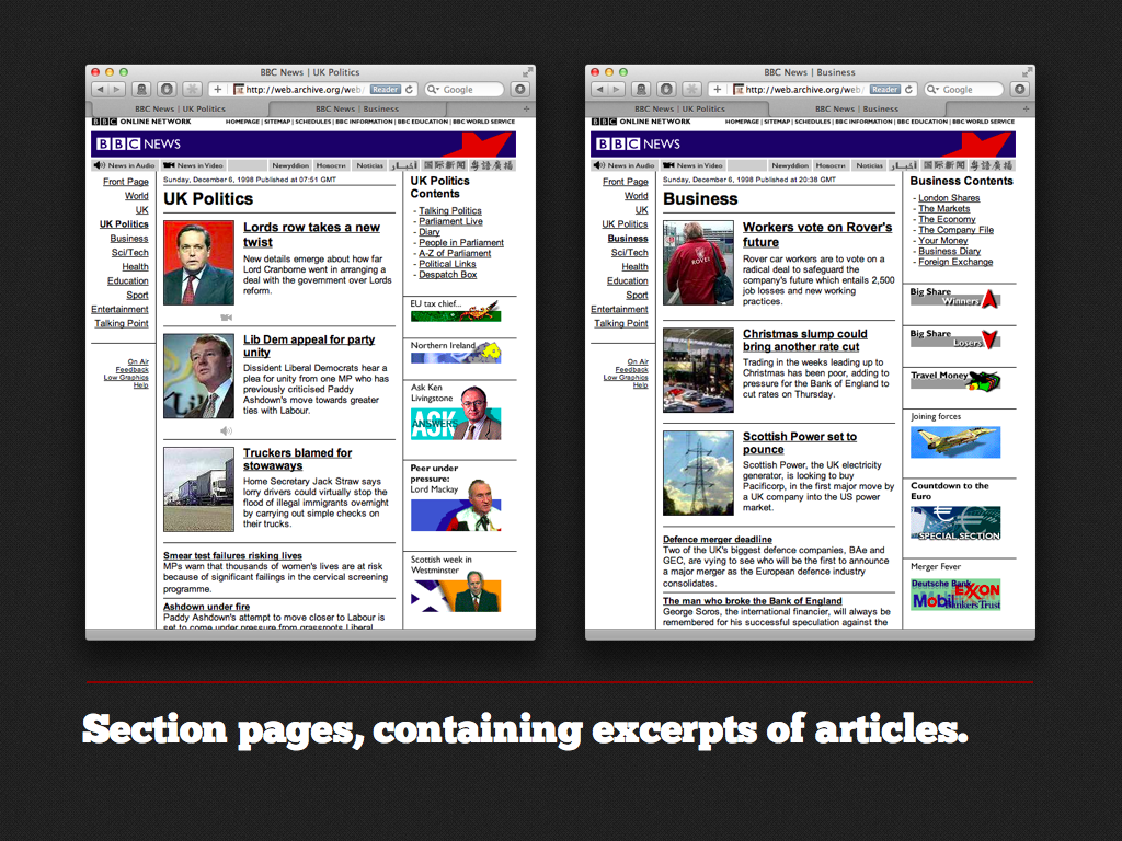
This is what lead us to the idea of having section pages in the information architecture, where you have excerpts of articles, and you can tap through to read whole articles. It’s not a new idea – this is the BBC news site from 1998. To be honest, it seemed like an infallible approach because it’s just so standard.
All we needed to do was take a spread from the print magazine – in this case a single page spread, and cut it up into excerpts, and fit it onto the iPad screen, like this. So let me show you the IA we ended up with.
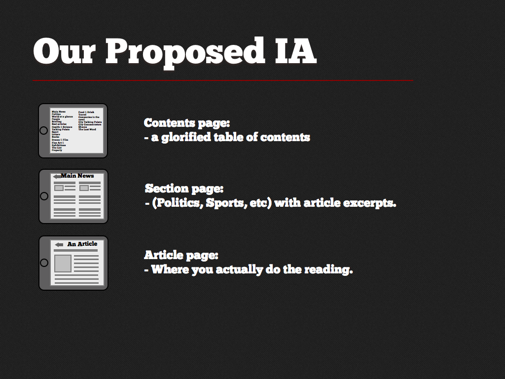
A contents page, basically just a glorified table of contents. Section pages – containing the article excerpts I just described, and article pages, where the real reading gets done.
The one thing we had up our sleeves was around ad placement. The ad team wanted to sell fixed position ads. So like in print, the HSBC ad would appear by the finance section, and so on. Now, we were determined not to have the app ruined by invasive ads. We didn’t want ads appearing on article pages. We didn’t even want them appearing between the pages of an article. So we pitched this idea that we’d have only full screen ads that would appear in between the section pages.
This way, we reasoned that the ads would only intrude on the act of choosing what to read, rather than the act of reading itself, which deserves to be put on a pedestal and left well alone. We took our keynote prototype to the stakeholders, and to our surprise they bought into it.
By this time we were about half-way through the project. We paired up with our dev partners. Who made an iOS native prototype, and we took it to usability testing. And let me tell you how that went.

It tanked bigtime. Suddenly I realised that usability testing is only fun when it rips apart someone else’s work! When you’ve spent weeks selling the idea to your client’s stakeholders, it’s pretty depressing.
Looking back on it, we made the classic architect’s mistake of designing for a fictitious user behaviour that only existed in our heads. When architects design public spaces, they have to design the paths. They have to define how people will move through their space.
And if they get it wrong, this is what happens.
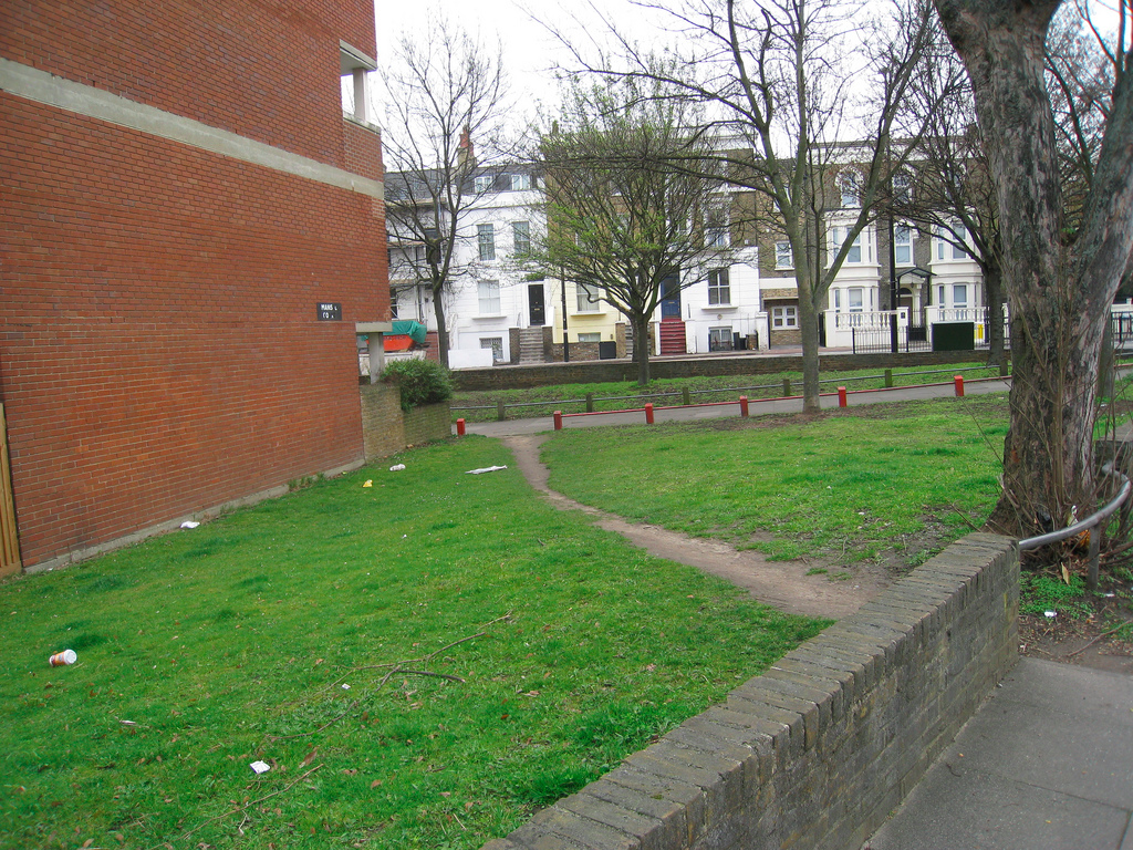
Desire lines. If you look on the right, there, you’ll see the council has even added a fence to stop people from doing this. Here’s what users did in the usability testing.
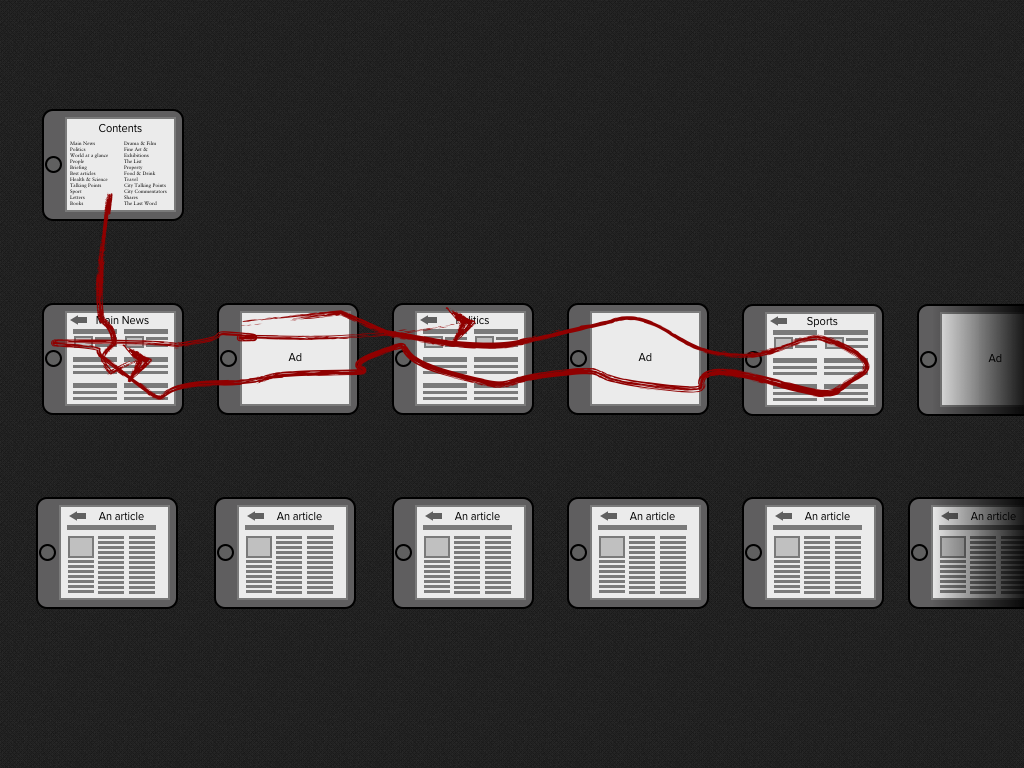
They were coming into the issue, tapping through to a section, and then casually flicking through all the sections. Now you may remember we put ads between the sections! So even though the ratio of ads to content was really low on a per-issue basis, when you looked at these real life desire lines, users were seeing an ad every other page. And they were saying stuff like “I would never buy an app with this many ads” and “it needs more work”. Meanwhile the client stakeholders were all sitting in a viewing room, watching all this happen live.
Although this was embarrassing, the ads weren’t going to be hard to solve. We could move them or use a different approach. Far more worrying was the fact that users just weren’t getting the idea of the three tier IA.
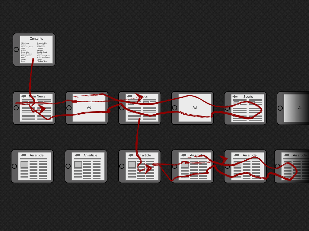
Quite a few of them would find there way downwards to the articles but then get stuck down there. They needed prompting to tap that top-left arrow to move up a level. Even when they did, they didn’t quite get it. It was as if these three tiers didn’t exist in their mental models, even when we gave them hints.
You know that feeling in usability testing when you can’t believe the users are being so dumb? Really, that’s the feeling of not understanding what the hell you’ve done wrong in your design work and being in denial about it!
Let’s take a look at one of the page designs.
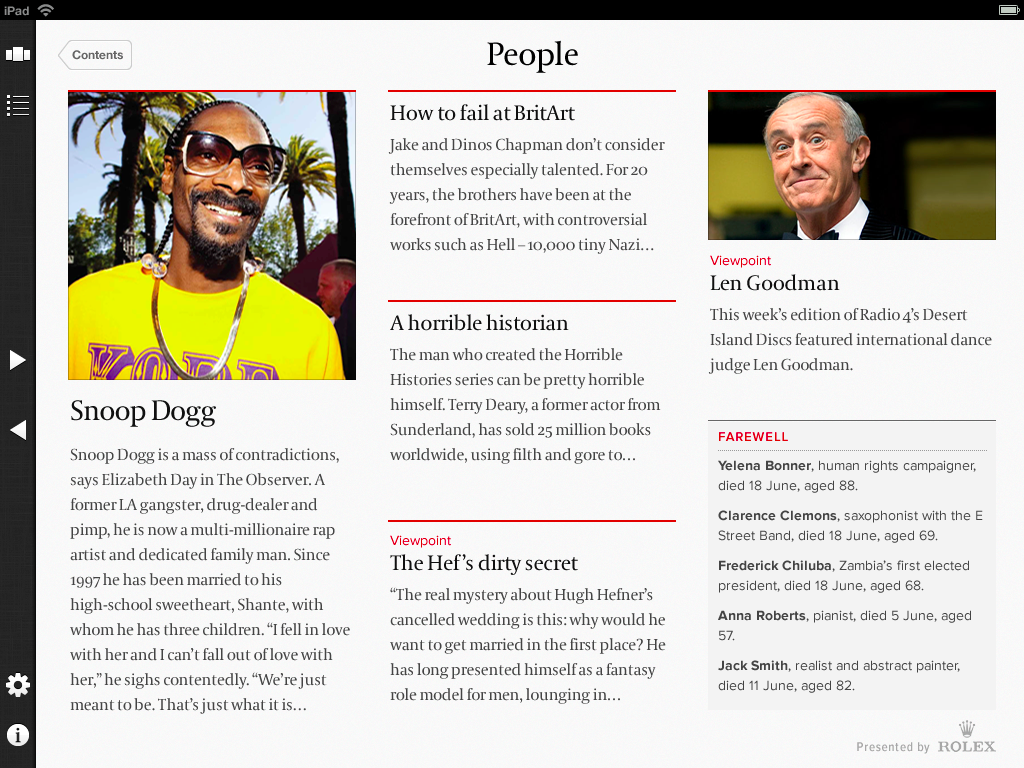
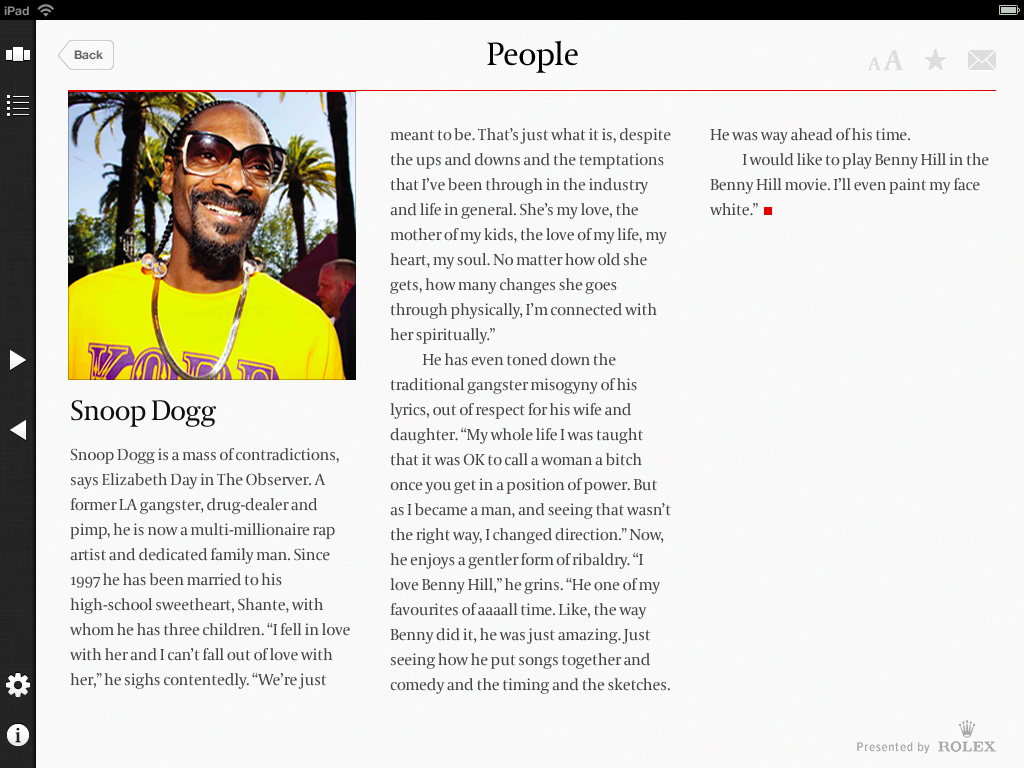
This is the people section, that we were looking at earlier. Now, let’s say I tap on that Snoop Dog article here. Let’s just anticipate the feeling of impact you’d want in the transition to the following page. What you really want is a BOOM! something to hook you into the story.
 <
<
What you get is this: “Pfffft!” It’s an anticlimax. It’s just dull. You know why we did it like this? To avoid the additional costs of image licensing for bigger images. We thought we were saving our client money.
Impact aside, this created usability issues because the article pages looked exactly like section pages.
We weren’t giving users a visual hook to hang their mental models from.
The back button at the top left made it worse. It’s just the wrong label. This button takes you up a level to the parent section, not back to the immediate last page you were on.
That evening on the train home, the penny suddenly dropped. We realised we could use a two-pane layout like Apple Mail. So the contents list would go on the left, and the list of articles would go on the right – like this.
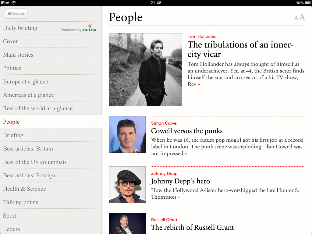
This design gave us a visually distinct contents area – this would never get confused with the articles. It also gave us a simple two layer IA. You were either here, in the contents area, or in an article. So if we tap on that top article about the vicar, we end up here:
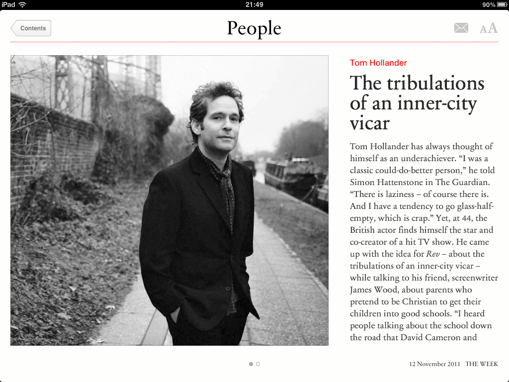
This design gives us a nice visual impact. It was going to cost a little more each week, but we now knew that spend was necessary. We also got rid of that crappy back button at the top left. Now it’s just “contents” which makes a lot more sense.
Also, now the ads only appear after the final article of each section. So that ad density desire line problem went away.
And we took this into a second round of usability testing, and it fixed all of the problems I’ve just described. I’ve never run a project before with that big a difference between round 1 and round 2 usability testing. This was a real relief.
All this said, we did still make some mistakes with the gestural UI that are still in the live app now. This is the map at a glance interface:
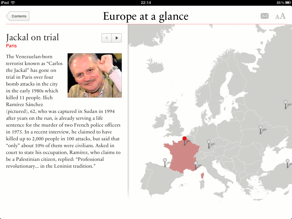
We didn’t get around to usability testing it in the iOS prototype, because we didn’t have time. It seemed fine in the initial Keynote prototype. The way you move through articles in this section is by tapping the arrow buttons above the photo, or the pins on the map. That seems OK in isolation- but if you look at in the context of the rest of the app experience, it feels wrong. In the rest of the magazine, you swipe through pages using a sideways swiping gesture. It’s a nice, laid back, soothing reading experience- but when you get into this section, you are forced to change the way you hold the device. Suddenly you have to take one of your hands, hold your finger like this and prod. It’s like switching from an iPad to an old stylus based interface from the 90s.
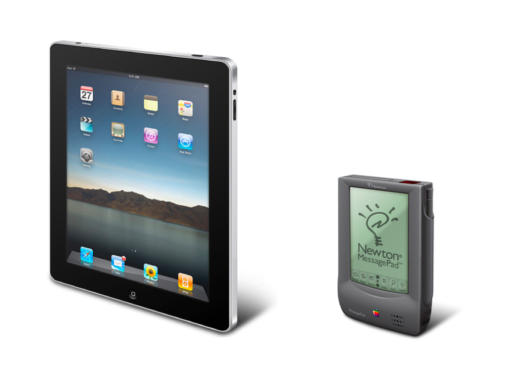
To put it another way, it’s like driving down a motorway, and mid journey, switching from a left-hand drive car to a right-hand drive car. It’s disconcerting. Suddenly you have to concentrate. All this really just goes to prove that you have to evaluate your interface in context. The whole really is more than the sum of the parts. In retrospect, it was pretty dumb that we thought that we could design a gestural interface, using Keynote, a non-gestural presentation tool.
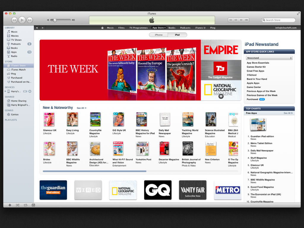
Looking back on it, the app has been doing really well in the App Store, and the project ended up totally on-budget with a very happy client. To be honest though, the real credit has to go to the journalists who write the content. That’s what people buy it for.
If you think about the tone of my story, some of the main themes were time pressure, worry, risk-taking, embarrassment, and recovery from embarrassment. For me at least, this is what real life user experience design is like. It’s nothing like the vision we normally portray outwardly to graduates and newcomers to the field.
There’s no pristine CSI laboratory stuff going on here – and we didn’t magically innovate using multi-coloured post-it notes and impressively well drawn sketches. We simply had the stamina to keep going through that cycle of making mistakes, analysing them and trying again.
You know what else interests me about our industry? We’re good at applying Psychology to our design work, but we always take our lens of analysis and point it at our users.
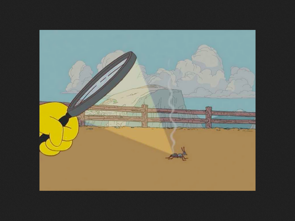
We’ve basically weaponized our understanding of Psychology and turned it into tools of manipulation and persuasion. For us to move forward, we need to turn that lens of analysis on ourselves.
Designers are human too – and we’re all prone to making the same kinds of mistakes.
Edit 22-Apr-2012:
Overall the The Week UK iPad app has been a real success. Looking at all versions up to v1.3.0, 71% (173/245) of the ratings have been 4-5 star. The project was delivered on time, on budget, and I believe it may have actually paid for itself on the day of launch through sponsorship deals. You may notice that v1.3.1 has had a handful of negative ratings. At the time of writing, I believe this relates to temporary problems with the print membership database, i.e. people are entering their subscription numbers and not being granted the access or discounts they’re eligible for. By the way, if you look it up on iTunes, be aware that we’re talking about the UK edition here.
Great post, Harry. Thanks.
Hi Harry, thanks for sharing your experience this honestly. I am a bit surprised that you make no mention of a competitor’s review during your process. There are many great iPad magazine apps already out there (full disclosure: my current employer did the iPad apps for The Economist and The Telegraph among others), and my first instinct would be to have a peek and see what they do well and what they don’t.
Fabien, we did a competitor evaluation before the first round of testing, but I didn’t mention it in my talk. It was a 10 week project – not huge by any means but still way too big to cover in step-by-step detail in a conference presentation.
In many respects, it was a fairly typical project for an established UX agency. The only big difference is that our client (Dennis Publishing) was willing to let us talk about it frankly and publicly. (Huge thanks to @sifter for that and @PaulLomax for that!)
The main reason I did the talk was to share a real-life UX design project story with others who have never been through it before themselves.
Great article and thanks for being so candid. We all go through these failures before we come out with our final usable product so its good to see that documented. Keep it up.
So true and so recognisable… ;-)
Hey,
Can’t agree with you more – we need to share stories and learn from others!
Thank you for the great post.
This is how I came up with a local event called – UX Storytelling (uxstorytelling.co.il/en).
Will be happy to invite you to visit Israel and share a story at our next event :-)
Michael
Thanks for sharing your experience, Harry–I’ve been there too and your story reminded me of similar struggles/resolutions in my own team. :)
I normally form part of that majority who do not comment on posts. This time, however, I just had to say ‘thank you’ – for telling it like it is, and sharing your experience. Great stuff!
Pingback: An extended talk on The Week Magazine’s iPad app design process
Really nice post, Harry.
Pingback: Sec 01: For Tuesday, April 2 | JCCC :: Advanced Design Practice
Pingback: Resources | Ryan Jones, Teacher of Design