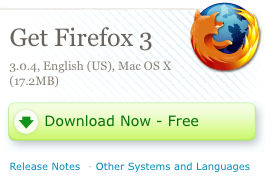
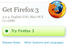
Mozilla’s blog of metrics has released the results of a small A/B test they ran recently. Which of the following buttons got the best clickthrough rate on the “customise firefox” page, and by how much? One of them was significantly less effective to a 99.85% confidence level.
Recipe A
Recipe B
You can find the answer and more information over at the blog of metrics.
My guess would be that A was more effective. I think the down arrow in B is not really associated with the concept of trying (as opposed to downloading) and so is interpreted as a navigational cue, leading users to look below. Also, download now implies there are no more steps to go through, whereas try now suggests the button takes you to another page.
I would also suggest that A is superior as it doesn’t duplicate “Firefox 3” text. The “Get Firefox 3” title gives the context and the button provides the action. Thanks for highlighting this A/B test Harry!
Variation ‘A’ because the wording is stronger. A good copy editor will tell you a strong call to action works far better than a weak one.
Download Now tells you do something now. Try sounds more wishy washy. It does not broadcast confidence.
Note that they had 300k page views before ending the experiment.
Pingback: Strong calls to action: the importance of wording - Blog - Red Gate User Experience