I’ve been having a lot of fun doing out of box experience design consultancy over the last few weeks (OOBE as it is pretentiously called by those in the know). If you’ve ever opened an Apple product then you’ll know what an excellent out of box experience is; and, if you’ve ever opened a packaged copy of Windows Vista you’ll know what a bad out of box experience is. [See a nice comparison on Robert Hoekman’s blog, via Reaction.]
If you look around on the web, there isn’t much in the way of out-of-box design guidelines, with the notable exception of IBM’s offering. So I’ve put together a mini set of guidelines based on a metaphor of the bento box.
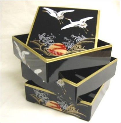
A bento box:
- Is a joy to use.
- Actively improves your perception of the contents, through attention to every minute detail.
- Encourages an order of consumption – the physical structure affords consumption of the top layer first. This is very useful if you need your user to do things in a certain order.
- Compartments are spacious enough to allow easy access to contents.
- Makes it just as easy to put things in as to take things out.
So next time you’re doing OOBE design with a bunch of non-UX people, introduce this metaphor to your team. It’s quick, it’s easy and it’ll give you a piece of common vocabulary to hang your ideas off.
I’m really interested to hear your comments – so please comment below! >>>
I have to agree with that and being a fan of Japanese food I love Bento Boxes, they add an extra special something to your meal. I love the experience of opening an Apple product as the experience of the joy of using starts from the moment you have the box in your hands and not when you have the actual product out of the box in your hands. Although I do find the Apple packaging slightly pretentious, the enjoyment and the feeling of quality do make for a quality moment.
The worst packaging I have come across has to be for toy products. Being a father of two I have loads of experience with this. I have spent up to 15 minutes and then given up and passed it on to the wife to open up and free our daughter’s birthday present from its plastic ties many of which are hidden away and difficult for someone with slightly larger then average hands.
So packaging is a very important part of your user experience and now with focus on their environmental impact its an area that people will grow increasing aware of. I will!!!!
I like the idea but ultimately, the packaging is something you look at briefly and then throw away. For me, packaging should be easy to flatten and should consist of a single material like just cardboard, not plastic laminated cardboard.
If you can tick these boxes and the ‘beautiful experience’ stuff, then it’s all good.
Personally, I agree with the three latest points which are the most functionals. Contrary to Geoff, one should not consider a packaging as something which will end up in a bin.. Packaging could be reused as much as possible (not only recycled) and for this purpose, some or all of its elements could be combined to get something else.
Consider a Lego’s packaging made with Lego blocks.
Discard!? Recycle!? Opening my iPad was a religious experience. I’ll keep the meticulously repackaged pieces of the packing forever. It was my virgin experience with brilliant design in something so mundane. Ok, and I’m a hoarder.