Historically, marketers have given targeting a bad name, with creepy email campaigns and annoying ads that follow you around – but the fact is, targeted messages can deliver a lovely experience if they’re done right.
An ideal restaurant is where the concierge knows your name and sits you at your favourite table. That’s good targeting. There’s a big difference between this and having them say “You almost bought an expensive wine with your meal last time. How about it today?”.
Let’s work through an example. Let’s say we’re designing a mobile app for runners (Imagine we’re the first one on the market to keep things simple). There are certain core activities that users will really care about – in this case tracking running performance and comparing performance with others. Thats pretty much it. However, there are lots of other activities that our business will want users to do, but the users are not yet particularly interested in. For example, if a user is just starting out, they’re probably not going to care much about connecting a heart rate monitor – they’d be crazy to go spend $200 before they’ve even finished their first 5k run.
If you run a workshop with the business stakeholders, you’ll quickly come up with a long list of actions like this:
- Complete a profile
- Connect with friends
- Encourage users to engage with friends on social media
- Encourage users to publish updates
- Make in-app purchases / buy a subscription
- Be aware of credits running out (if using a credit-based model)
- Connect associated products (heart rate monitors, fitbits, etc)
- Review our app
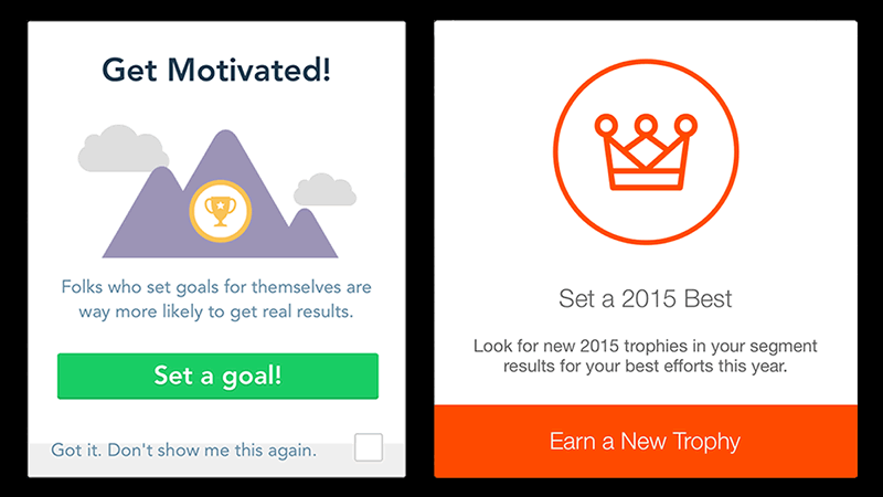
- Respond to usage tips (e.g. “You haven’t tried doing a group challenge yet…”)
- Use our referral scheme
- Buy our branded clothing
- And so on…
In this list you’ll notice a few things that deliver value to the business but not to the end user. For example, asking users to “complete a profile” is pretty meaningless on its own. Nobody really wants to buy your branded clothing. The action needs to be linked to something that delivers them a clear benefit. This means you’ll need to work on your list to ensure each item answers the users’ question of “What’s in it for me?”.
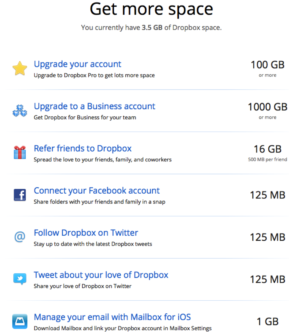
One of my clients refers to their list as the “ladder of engagement”. For them it’s a short, linear sequence of actions they want users to complete one-by-one (Dropbox uses a similar approach). Other clients have a complex mix of actions and contexts – which can be hard to rationalise into a coherent system.
From a user’s perspective, this list is inherently dull and unappealing. Even if you put it in front their noses, they’re not going to want to pick through each item one by one – there’s simply too much noise and too little value. What we need is some way to invite relevant actions from a given user, at a time when they’re in the right frame of mind (in sales terminology, when they’re a “hot prospect”). In doing this we need to make sure the user never feels nagged, annoyed or burned out. This means we need a system to orchestrate the contextual targeting.
Luckily, from a development perspective it’s not that complex – all we need to do is create a decision table that maps contextual triggers against appropriate actions. Let’s start with some terminology. Firstly, there’s the UI element in which we encourage users to take an action – let’s call this the “call to action”. Then, there are the locations in the UI where you want these calls-to-action to appear. Let’s call these “slots”. For this exercise let’s assume we’ve got just one slot – a modal dialog that appears when the user successfully completes a run.
Post-run modal dialogs in Runkeeper and Strava
Of course there are lots of other types of slots you’ll want to consider in your own work, for example:
- Infobar: a strip along the top or bottom of your UI that provides information but doesn’t force the user to interact with it (See Google Chrome’s ux docs).
- Dashboard hero slot: a prominent slot on the dashboard or home screen
- Activity feed slot: if your app focuses on an activity feed (similar to facebook / pinterest), it makes sense to interleave the call-to-action slots with other content.
- OS notification: these are powerful but can be overkill. Remember – an OS notification interrupts the user as they go about their normal life and should be reserved for something of genuine importance.
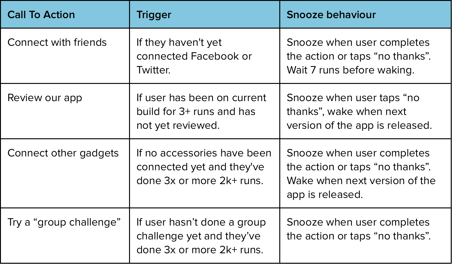
Finally there’s the triggering context: each call-to-action needs its own trigger. For example, if the call-to-action is “Connect with friends” then the trigger would be “if they haven’t yet connected Facebook or Twitter”. Before we draw up our decision table, there’s some additional stuff we need to consider:
- What happens if the user taps “no thanks” and dismisses our dialog? We need to be able to mute it for a period, then unmute it later. In other words, we need to define a “snooze” behaviour.
- How many times do we want to repeat the same dialog? if a user taps the close button a few times over, it’s pretty clear they don’t ever want to see that dialog again. Let’s say we only want to nag them 3 times on any given action (which means we need to implement a snooze counter for each action).
- How can we limit the rate of dialogs? Pacing is important to avoid user fatigue and annoyance. We need a rate limiter for the system as a whole. Once a dialog has been actioned or snoozed, the system should shut up for a period to give the user some breathing space (e.g. “only show a dialog after every 3rd run”).
With all that in mind, here’s the decision table, depicted below. It runs from top to bottom, like a series of if/then/else statements. For example: the first row is evaluated. If the trigger statement is true and the action is not snoozing then the dialog is shown. If those criteria are not met, the second row is evaluated, and so on. When you get to the bottom of the table you loop back around to the top again. This means there is a order to the list – for example, the user will see “find friends” before “turn on notifications”. This gives you a way to express your priorities.
Of course there are smarter ways to do this. Microsoft Clippy was originally powered by a bayesian network, and that was back in the 90s. The reason for using a decision table here is because of its simplicity. We’re not designing Google Now – we’re designing an ancillary feature of an app that has other purposes. It’s important to keep the UX manageable, clear and easy to test.
To conclude – I hope I’ve shown that if you’re going to do any contextual targeting in your products, you need a systematic approach that ensures users don’t feel nagged. If you reach for a prototying tool like framer.js, Origami or Axure, you’re missing the point. You need to map out your triggers and actions. If you’re a UX specialist, this is your domain. Nobody else undestands your users and their real-life contexts the way you do.
Given that the Apple Watch and other wearables are being released this year, we all need to get good at designing UIs which show the users the right thing at the right time. Hopefully this article gives you a starting point to think about this stuff.