Email verification is often needed as a step in user registration. It plays the role of an identity check – to confirm that the person registering genuinely owns the email address given.

If you run a site that uses email verification in its registration process, here’s a challenge for you: go and find out how many users successfully fill in the registration form but never complete the verification step. If it’s higher than a few percent, you should probably be worried. In fact, whatever the percentage is, you should be thinking hard about how you can bring it down – after all, any leakage is bad leakage.
This isn’t a ‘normal’ conversion rate calculation we’re talking about here. Conversion rates, as they are normally defined, involve comparing the number of users who perform an action against the number of unique visitors (i.e. people who happen to hit the first page). Amongst these unique visitors, a large proportion of them are likely to never actually have been likely to convert (they were lost, having a look, or doing something else), which means you naturally get a large number of drop-outs.
The difference in this scenario is that we can be sure that all of the users were dedicated to completing the task – after all, why else would they have bothered to complete the registration form? They’ve done the hard bit – surely all of them should have completed?
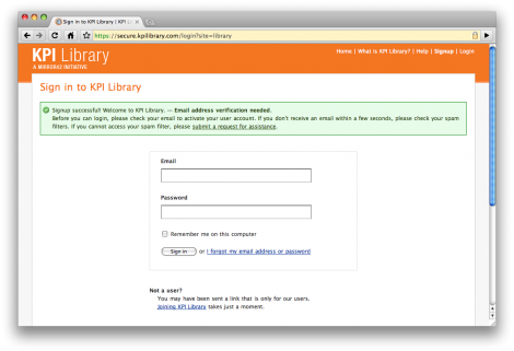
Failure to complete the email verification step is sometimes caused by deliverability issues. However, it’s also entirely possible that the problem lies in your call-to-action design. Here’s an example from KpiLibrary.com (a nice site that happens to have a slightly flawed registration process):
What the user needs at this point is a large, unmissable call-to-action such as “Check your email now“, with no other irrelevant content around it. However, on this page there’s a mixed message – it starts with a green tick icon and and the statement “Sign up successful!…” – but it then goes on to explain that they need to check their email. Users are very likely to skip past the text and start filling in the log-in form, which will inevitably return an error. This is something that Luke Wroblewski refers to as being like “muscle memory”. He goes on to explain (transcribed from a podcast):
“… Time and time again, […] people try to preface a web form with help text or explanatory paragraphs […] and every just about single person skips over all that and goes to the first thing that looks like an input field.”
I’ve certainly experienced exactly the same effect myself in many user research sessions in the past. Here’s another example of a weak email verification call-to-action, this time from Mailchimp (which will probably be fixed the time you read this – they are very dedicated to UI design):

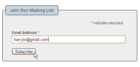
Here I am poised to register my email address…

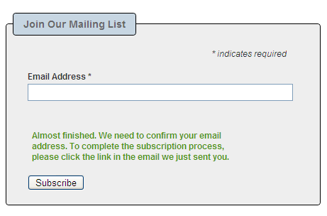
And here I am done. Except I’m not. The text in green – which looks like it’s a positive confirmation – is actually telling me that I must go and check my email.
Like many other usability issues, the problem is incredibly obvious once it’s been pointed out. As Steve Krug puts it:
“If your audience is going to act like you’re designing billboards, then design great billboards.”
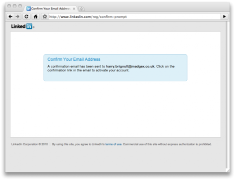
Here’s how Linkedin does it. A nice example of a clutter free page, stripped down to the core message to ensure the point cannot be missed:
Linkedin also provides OAuth-based verification if your email provider supports it (e.g. gmail), which is probably something we’ll see a lot more of in the future.
Finally, one thing to remember is that email verification doesn’t always need to be a barrier to registration. Just because your competitors do it, doesn’t mean you have to copy them. Facebook, for example, don’t do it – they use a form of lazy registration so people can start using the site before they’re verified.


Some efforts have been made to solve this problem. On UserGlue, one guy has a design that attempts to solve this tricky fish.
While we are talking about user registration… Jef Raskin in The Humane Interface challenges the need of a having a user name in the first place. Read it on page 183 and make your own mind up.
Hmm, you’re taking about the problem of typos in email addresses. In this post I’m talking about the problem of verifying that the users actually own the email address given. The two things are related, but not the same.
Good point Harry. I have just contributing to the great love-in. Once you start something on the world wide web who knows where it will end up.
Pingback: Weekly Roundup: Design Related Links #11 « Discovery Session… by Gerard Dolan
Pingback: Weekly Roundup: Design Related Links #12 « Discovery Session… by Gerard Dolan