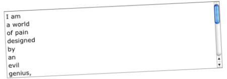
You’d be forgiven for thinking that the standard form controls offered in the HTML specification are a good thing. They’ve stood the test of time, they’ve evolved and users have grown up with them. It’s always far safer to use the standard html form controls than attempt to reinvent the wheel, Right?
If only that were true. In reality some of them suck big time, and front-end developers around the world are forced to build workarounds on a regular basis. The worst culprit is probably the multiple select box. In fact, I don’t think I’m exaggerating if I say that the multiple select box is probably the least usable form control in the history of the web, and should be best avoided at all times.

Here are some of the problems I see in face to face research sessions when watching low competency users struggle with multiple select form controls:
- Some users don’t know about the ctrl-key. If there is a label, they don’t read it. These users will click an item, scroll down until that item is hidden, click another (thinking that both are now selected) and then continue doing this a number of times until they realise it somehow didn’t work. So they start again, painstakingly clicking each item as before, only to find it didn’t work a second time. Eventually they give up, and they aren’t happy.
- A small number of users know about the shift-click combination, but not ctrl-click. Shift-click only selects adjascent items – so these users assume that for some reason the system has been designed like this on purpose. Sounds crazy but it’s a fairly rational deduction. A lot of people don’t enjoy dwelling on user interface quirks, they just muddle through.
- Scroll-wheel lovers get a nasty shock when they try to scroll a multiple select box while holding ctrl. In most browsers, the page zooms in or out. The page layout “goes weird”. Often they don’t know how to set it back to normal and they’ll spend the rest of the session with the text either ridiculously big or small.
- Even some savvy users don’t trust multiple select boxes. They know that just because they are able to select multiple items, the system might still throw an error when they submit the form (e.g. “Maximum 3 items”). All they can do is scan the page for tips, then hit submit and hope for the best. It’s not ideal, is it?
You have to wonder how multiple select boxes have survived in their current state for so long. I suspect it’s because they don’t cause users to drop-out of a process – users can scrape through by selecting a single item, and thus it doesn’t show up in analytics data.
The situation sort of reminds me of how diseases work – if they cause too much trouble, they kill off their hosts, and kill themselves in the process. An effective disease messes up the host, but keeps it relatively stable so it can spread and infect other hosts. If you use multiple select boxes in your UIs, I suggest doing a quick analysis of your system logs. Does the number of users who select single items seem to be unnaturally little high? I bet it does.
Luckily, quite a few front end developers have recognised this problem and have put together some JavaScript solutions. This post by Ryan Cramer details four alternative enhancements and explains their strengths and weaknesses. Interestingly, there is no ‘catch all’ solution, and you need to consider the subtleties of your context before you make a decision. Is your list short or long? Does it have an important hierarchy that needs representing? Is the list known or unknown by your users? Will the form ever be loaded with preselected items that the user needs to see at a glance?
Some of these JavaScript solutions are pretty neat, and between them all you should be able to find one that meets your needs. You’ve got to admit, though, that it seems inefficient. Why are we still jumping through hoops to achieve a baseline level of usability?
Harry, I completely agree.
I steer clear of them completey. Most of the time I just use a check box list instead which obviously takes up more room.
Even standard select lists are a nightmare because you can't really do much with them using CSS. I recently tried building my own select list control in jQuery and used it here – http://www.compareforeigncurrency.com/ – it's a bit buggy and was done in a hurry but I might try working on a checkbox list contained within a dropdown for when multiple selects are needed. I don't think it would be hard.
Personally I just build the scrolling tick box lists right into the form so no Javascript is neccessary.
Danny – yes that's probably the simplest solution but you're still left wanting more if you have a hierarchy and want to show checkbox inheritance; if you have a long list and you need to avoid the selected items getting hidden when scrolled away; and so on.
With CSS you can create a block of checkboxes (or any HTML) that scroll, no Javascript required. It’s not an iframe either, so it means it can be inside of a bigger form.
Excellent points Harry. This always comes up in testing – including the “don’t trust it” user.
On a slight tangent, a native (to Windows) form control that is completely missing from HTML is the combobox, where users can type in a select box to either quickly find an option or to add a new option. As you’ve no doubt seen, there are ajax implementations of this sort of thing around (especially search-ahead type controls) but it’s irritating there’s no native control for this – it can be really useful sometimes.
Oh, definitely! I was just chatting to James Wragg about this. There are lots of not-quite-perfect web implementations out there…