Before I start I’d like to say I’m not a Microsoft Hater. I’m actually very, very impressed with Office 2007 – the UI design is great. And when I saw today’s splurge of blog posts about the new Zune, I have to say I thought it looked pretty tasty.
Check out Zune.net now before you read this article. See if you can notice any usability or user-experience problems. If you’re like me, you will probably be wondering how so many serious problems managed to slip by. Given their scale and massive resources, Microsoft should know better. Right?
As a User Experience consultant I see these kind of ‘obvious’ mistakes all the time. It’s unlikely that it was because of a stupid design team. It was probably smart people using a stupid design process. The bottom line is, there was no love on this project. I bet nobody was given the role of loving this site, cherishing it and calling it their baby. Everyone did their bit in their cubicle, someone else glued it together, then they all moved onto something else. They were probably hugely multitasking with a million other things too. You can imagine the office where it happened – nobody chatting, an uncomfortable atmosphere, and everyone retreating into their headphones.
It’s a classic piece of pass-the-baton relay race design. On paper it ticked all the boxes and it got released. But box ticking doesn’t capture user experience, and this is how it slipped out without being noticed.
How could Microsoft have avoided it?
They should have employed a user-centred design (UCD) process. With UCD you take the guesswork out of design and you catch mistakes before they get released. With UCD, your design team ‘lives’ the user experience before it even exists – while it’s still sketches and post-it notes. They periodically spend time in contact with end-users, observing interviews, watching highlight videos of user tests and engaging in various kinds of participatory design. UCD creates an atmosphere where team members are respected, not hated, if they speak up when they see something isn’t right.
Now lets look at some of the mistakes the Zune.net designers made, and how you can avoid making them yourself.
Design mistake 1: ignoring user expectations
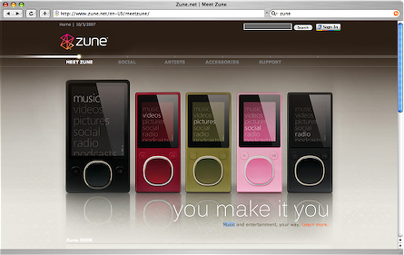
Look at those lovely shiny Zunes on the front page of zune.net. Don’t you just want to play with them? If you’re like me, you’d probably now wiggle your mouse over them to see what cool interactive wizardry might happen. And what happens? … Nothing. It’s a static jpeg, just like it is below. So then you’d probably click on the image, the text, and the buttons. Still nothing happens. Thousands of users like you have just done exactly the same thing today. An instantly disappointing first experience.
Lesson learned: never ignore user expectations. Use paper sketches to test your designs early on. Always be up-to-speed on contemporary best-practice guidelines and heuristics. Your entire team should know Nielsen’s heuristics off by heart, and should be able to recite Steve Krug’s ‘Don’t make me think’. It’s easy stuff. Basic usability training only takes one or two days.
Design mistake 2: no clear call to action
So what now? You’d probably look around the page looking for the main ‘thing to do’. Usually there is one prominent button or link that entices your attention. This is known as a ‘primary call-to-action‘, and the Zune homepage doesn’t have one.
Lesson learned: use prominence to indicate a primary call to action. User testing takes the guesswork out of this.
Design mistake 3: missing proposition
If you’re like me, you probably arrived at the site wondering what makes the new Zune different. Is it smaller than the new iPod? What new things does it do? What old things does it do better? What’s it like to use? Basically, should I put my iPod on eBay? The front page doesn’t tell us anything. We are left guessing.
Lesson learned: communicate your proposition clearly on the front page. Your front page proposition is like an elevator pitch: first impressions count. Hire a competent web copyrighter. 10-seconds tests are also a great method for front page proposition communication – you show a user the page for roughly 10 seconds, hide it, then ask them what it was all about. If they ask lots of questions back at you, then your page needs work.
Design mistake 4: misuse of space below the fold
The fold (i.e. the bit below the bottom of your screen) is something you should take advantage of as a designer. And what did the designers put there on zune.net? A useless gulf of white space, and then something unforgivable.
Lesson learned: in Judo, you’re taught to take advantage of the momentum of your attacker. You need to do this with the fold: rethink a negative situation into a positive one. Instead of seeing it as a place that’s of no value for primary content, you should see it as a great place for secondary content.
Design mistake 5: poor text contrast
Small white text on a very pale beige background. I’m trying hard to resist ranting here, but who on earth would actually find this readable?
Lesson learned: I’m not going to get into accessibility here, but it suffices to say that this and other basic accessibility mistakes can be easily avoided using the W3C WCAG guidelines.
Design mistake 6: lack of feedback from user actions
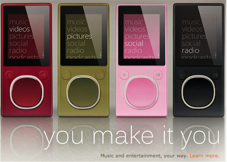
Try clicking on the ‘meet zune’ link from the front page. What happens? If you haven’t got a very big monitor, you’ll answer ‘absolutely nothing!’. Above the fold, the page barely changes. A new page does load, but above the fold, it looks identical. You have to scroll down. And what do you get? More similar pictures of the Zune. Some light-brown on beige writing, Some small text, and a row of five coloured buttons.
Design mistake 7: no understanding of shopping behaviour
If you click on one of those coloured buttons, What would you expect to happen? Would you expect it to pop up a new window containing the page shown below? No. Personally, I’d expect to see a photo of a Zune in that colour.
If you think about about natural shopping behaviour, people tend to want to explore, learn, compare options, and then purchase. Currently the Zune site assumes that on arrival, with barely any factual information, you are already ‘hot’ enough to make a purchase. This is just wrong. At this point most people are ice cold and they aren’t going to get their wallets out if they don’t know what they are buying.
Design mistake 8: making the user work
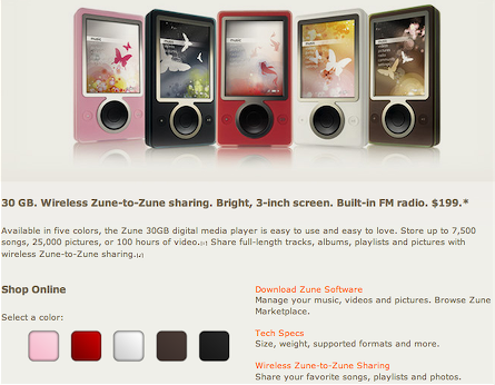
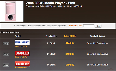
If you look at this page, you’ll notice some very sloppy information architecture. The nav bar shows you as being in the ‘accessories’ section. But the Zune itself is not an accessory, its the core product. (A car charger is an accessory.) The photo of the Zune is small, and in a jarring white box Barely any product information is stated: “Internal Hard Drive, FM Tuner, 14 Hours – MPN: JS800016.” If you stop a random person on the street and ask them what the Zune features are they’d come up with a better list.
Then, in a strange font, the phrase ‘calculate your bottomlineprice including shipping and tax’ is shown. Since when was bottomlineprice ever written as one word? What’s worse, this is actually a GIF image. Then when you scan down the page you have to stop and think: “Why is wallmart fifty bucks more?” “What is all this nonsense about entering zip codes?” “Do I actually have to type my zip code in to get the price?” Imagine this as a conversation with a sales assistant:
“Hi, how much is that Zune in the window?”
“It’s between two hundred and two fifty bucks. Whats your zip code?”
“What?”
“I said, what’s your zip code, buddy, what’s your zip code?”
“Why? Does the two fifty model have more disk space?”
“I can’t tell you. Now what’s your zip code?”
(and so on)
Lesson learned: when you have a feeling there is something wrong with your design but you can’t quite articulate what, try acting out a dialogue between the site and the user. As you can see above, it emphasises the temporal details of the interaction. (I think this is originally an Allan Cooper method.)
Okay I’ve run out of steam now, but there’s 8 whoppers and I’ve barely even scratched the surface. What other design mistakes can you see? I’d love to hear your ideas in the comments section…
If you click on ‘SOCIAL’, the first thing you see on the page is ‘VHS OR BETA’. At first I thought the zune was being likened to Betamax! It took me a while to work out that it’s the name of a band. I wouldnt have expected to read about a band under ‘SOCIAL’. I thought it would be something to do with the WiFi file sharing facilities. So that’s design rule 1: don’t ignore user expectations?
How about that the zune is shown as two different sizes on the front page image. Can you choose between the large black model and the ‘microzune’? It doesn’t say!
Having worked at MS on a short contract (that I cut even shorter because in the end I just couldn’t stomach working for them given their lack of focus on good design; that and the commute from Seattle to Redmond is a bitch), I can tell you that you pretty much hit the nail on the head with this assertion:
“I bet nobody was given the role of loving this site, cherishing it and calling it their baby. Everyone did their bit in their cubicle, someone else glued it together, then they all moved onto something else.”
I think that a huge part of MS’s problems in terms of design is that they hire design contractors – by the thousands – who just come in an pump stuff out. It’s like an assembly line. You sit in an overcrowded cubicle space, fully aware that as an orange badge (e.g., contractor), you are relegated to a much less valued position than a blue badge (e.g., permanent employee). And these aren’t just junior design positions that they contract out; I have a friend on contract who’s a lead designer for zune.net.
I have heard that Apple does not hire their designers this way. Nor does Amazon. Contractors really have no reason to be vested in the success of a product, nor are they elevated enough in the hierarchy for their opinions to make much difference.
Funny thing is, though, MS has half a building (if not more) dedicated to usability labs. Apparently, they weren’t put to good use in the development of this site.
There’s a couple of problems with the upper navbar too…
The active area extends significantly beyond the actual written words, but there’s no boundary. The subcategories pop up without clicking on the main category, so if your mouse pointer inadvertantly strays into, eg, “Accessories” en route from “Support” to “Troubleshooting”, you loose your target link.
Also, the Accessories category is inconsistent…. On the main Zune site, there are three subcategories, but once you hit the rebranded PriceGrabber page, a fourth category is magically added.
what is your opinion of the new zune website since this criticism was put up?