Douglas Karr pointed out that I should put my money where my mouth is and explain how it should be redesigned. Having given it some thought, I’ve realised this is a particularly tricky dialog box – the problem does not exist just at the level of the dialog box but more widely, for example:
- The keychain: what the hell is it? To a naive user this is a hairy concept.
- The security of your computer: What caused the application to update? Was the source trustworthy?
- The repercussions: what does the decision actually mean? What’s the worst that can happen? How can I recover from making the wrong decision?
I’ve also just realised that this has been blogged about elsewhere, with some great comment discussions. Read more here, here and here.
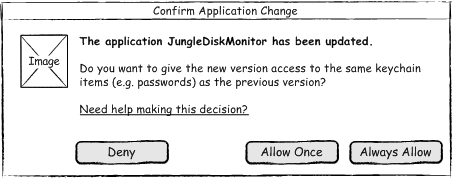
My working “solution” is shown here. It’s still fairly wrong but at least it’s more clearly worded and the button labels actually correspond to the question.
I welcome critical comments so feel free to get your knives out :-)
Yikes! Comic sans serif! What were you thinking?!?
I hang my head in shame. I was using an otherwise fantastic Visio template made by Niklas Wolkert.
Get it from here (but dont forget to change the font):
http://www.guuui.com/issues/02_07.php
Slightly better.
‘Allow Once’ and ‘Always Allow’ are a bit ambiguous. Always for this app or always for any app? Most users would get the fear at being asked to make that distinction.
I think full sentences are needed rather than small button actions:
——————————————————-
JungleDiskMonitor has been updated.
• I’d like to allow the new version access to the passwords I stored for the previous version
• Don’t allow this version access to my stored passwords
—————————————————————-
and I’d argue that ‘Allow Once’ can be dumped. If the app is untrustworthy then ‘allow once”=”allow always”. If it’s trustworthy then it doesn’t matter…
Is there anyway to prevent the user having to face something this murky?
PS I think ‘fake paper mockups’ might be one of the times when comic sans is appropriate! Tekton would be a bit nicer though ;-)
:)
I pinged you on it because I think you were a little premature in your criticism for a couple reasons:
1. The Keychain is thoroughly explained the first time you have the opportunity to utilize it in OSX, so users actually do understand the terminology and would not abruptly come across this without a clue of what to do. The dialog window in question, could have been worded better – but an OSX user (especially one that’s updating their applications) should understand what the dialogue is stating.
2. There really is no deny. Since the previous application is already in the Keychain, you must answer the question ‘once’ or ‘always’. If you don’t want it in the Keychain, you can open the Keychain and delete that application from it. The keychain isn’t quite the same as a Windows Password reminder, it’s much more accessible.
Your messaging is far better, though!
Hi Douglas,
I have a feeling that OSX overestimates how much their users understand about the OS and the keychain. Non techies may at best have a vague conception of it being the place where passwords are stored.
It’s a good discussion but I’m now regretting posting the rushed wireframe above. Oh, the perils of blogging!
You’re probably right, Harry! Too funny on the wireframe… I love that the first comment by Joe was nailing you on Comic Sans. Now that was funny!
Andy, keychain is not just for passwords…
http://en.wikipedia.org/wiki/Apple_Keychain
Regarding Douglas’ two points:
“1. The Keychain is thoroughly explained the first time you have the opportunity to utilize it in OSX, so users actually do understand the terminology”
It’s a terrible idea to assume that the user knows. Quite possibly he didn’t read your “thorough terminological explanation” because his attitude is “what do I care, I want it to just work”. The Mac philosophy actually encourages that kind of thinking.
Or maybe the explanation was half a year ago and he just simply forgot.
Saying “why, of course the user knows everything” strikes me as usability suicide.
“2. There really is no deny. […] you can open the Keychain and delete that application from it. The keychain isn’t quite the same as a Windows Password reminder, it’s much more accessible.”
No, the deny button is the point of the whole thing. From what I understand, the dialog is designed for the following situation: I’m evil and replaced your Safari with a malicious program. I managed to do this without your noticing. You start “Safari”, thinking it’s the legitimate thing. Then it tries to access your keychain to silently email everything to me.
In this situation the dialog is important. The idea is that the user goes “whoa, I didn’t consciously update that app, this is fraud”. The “deny” button is the point of the whole dialog.
My take on how to fix the dialog: Get rid of it.
1. If I develop a Mac application, I have to specify a URL somewhere in the app’s metadata. It points to a file on my website which lists all the app’s versions.
2. When my app is installed and first uses Keychain, Keychain stores the URL.
3. When my app is updated and Keychain would normally show the dialog, it instead checks the URL, which tells whether the new version is legitimate (could be identified with MD5 sums). Note that it looks at the URL of the old program, which we assume as legitimate.
4. If legitimate, Keychain updates without asking.
More technical effort, and not fleshed out, but less problems for the user. (Didn’t Apple have that philosophy in some distant past? Nowadays it seems to be “appearance is everything”. Which is of course a better philosophy as far as marketing and cult-building is concerned.)
Hendrik – I like the cut of your jib! :-)