There’s been a lot of talk lately about Snap’s “preview anywhere” mouse-over menus lately, and how they are a usability nightmare.
Well, I’d like to add my 2p by turning this discussion on its head and pointing out a couple of sites where mouse-over menus are done right (Amazon US & Yahoo), and how they’ve managed it.
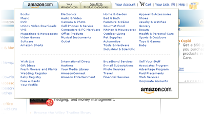
On Amazon US, if you mouse-over the “See all 36 categories” tab, (or “Find Gifts”), a large menu pops-up. On Yahoo, something similar happens if you mouse-over the dynamic “mail / messenger / etc” area on the righthand side of the front page.
When you use these menus, they somehow “feel right”. They are different to the Snap Preview Anywhere menu, and all the other old school mouse-over menus that usability people everywhere have moaned about since the beginning of time.
So how come they are being done right? It seems to me that there are three main factors: (i) the delay, and (ii) the hit area and (iii) the context of use.
The delay needs to be long enough to distinguish an intentional “hover” (Scenario: user pauses cursor over the link and thinks “… I wonder what that is…”) from a mouse that happens to be flying by on its way somewhere else. But also, the delay needs to be short enough to happen before the user clicks the link or they move their mouse-away.
In the case of overlays (menus that cover up the content beneath), you need the menu to dissapear pretty quickly on mouse-out, since when users are done with the menu they want to get on with reading the site. This brings us onto hit areas. With small menus, if the user “wobbles” their mouse and accidentally moves the cursor outside of the hit area, the menu disappears while they are trying to read it, which is extremely frustrating.
Amazon avoids this problem by having a huge menu with a big gutter around the clickable items. This makes it easy to close the menu on purpose (a clear, purposeful push of the mouse outside of the hit area) and hard to close it by mistake.
Finally this brings us onto the context in which mouse-over menus are used. Mouse-over menus are a high prominence techique that should be used sparingly, and only for things that are likely to be very important to your users.
So, in conclusion, lets apply this framework to the Snap Preview Anywhere menu:
- The delay: interestingly, the default delay is set to 0.5 seconds which isn’t too bad- this doesn’t seem to be their problem.
- The hit area: is a small, awkward shape, making it easy to accidentally mouse out when you are moving your mouse from the hyperlink into the menu, or when trying to hit the controls (e.g. the “options” link) which are too near the sides.
- The context: the Snap Preview Anywhere menu is normally found all over a page like a bad rash, all it gives you is a low res, highly compressed screengrab of the linked-to page.
Harry,
My name is Erik Wingren and I head up UX Research for Snap — the company behind the Snap Preview Anywhere (SPA) web service.
First I want to express my genuine appreciation of you sharing your experience with SPA and analysis thereof. This is how we learn and develop.
While I agree with the basic premise of your analysis of the SPA interaction, I have to state that I think the meaning you attach to your third point — “context of use” — is either unfortunate or unfitting. Please don’t get me wrong — context of use *always* matters — but IMHO the true importance and meaning of that point is lost when you compare SPA to *fixed navigational UI elements*.
Snap Preview Anywhere is not designed to be a fixed element on a single page. On the contrary it is designed as a distributed web service that enables site owners to enhance hyperlinks on their pages with preview functionality.
Again, I agree with the basic premise of your analysis. In fact, I recently posted an article on our blog where I reiterate Snap’s design objectives, acknowledge and respond to key points in the recent criticism and outline usability enhancements, aimed at solving the issues you raise and then some: The Snap Preview Anywhere Use Case
Cheers.
—
Erik Wingren
Snap UX Research
erik[at]snap[dot]com
Hi Erik,
thanks for stopping by and posting your comments.
I understand that SPA is not meant to be a fixed element on a single page. I think this is basically why I have an issue with it – this style of mouse-over interaction is very prominent and can be overwhelming.
Pardon my metaphor, but mouse-over interaction is a bit like sesame oil. If you use the appropriate measure in the appropriate dish, it’s a wonderful improvement. But if you add it slap dash to everything you cook, it quickly becomes your least favourite flavour.
It’s clear that some people do like SPA, and some people really don’t like it. So, to me it seems like that its more appropriate to offer on a per-user basis than a per-site basis. A Firefox / IE plug-in would allow people who want it to opt-in. The current model is that the people who don’t want it need to opt-out – and since opting out involves adding a cookie, they have to remember to do this again every time they erase your cookies.
Pingback: Ha véletlenül mégis túl sok tabod lenne | My Blog